Bar and column charts can present a number of quantitative fields in an eye-catching fashion. Generally, you'll draw a layer with bar and column charts when your layer has a number of related numeric attributes that you want to compare. Bar/column charts are useful for showing relative amounts rather than proportions or percentages.
The following examples show the use of bar and column charts to show the distribution of population by age for each county.

- Right-click the layer you want to display using bar or column charts and click Properties.
- Click the Symbology tab on the Layer Properties dialog box.

- Click Charts and click Bar/Column.
- Under Field Selection, click the numeric field(s) that you want to map. Then, use the arrow buttons to add and remove fields to the field list.
- Optionally, select a Normalization field to normalize the data. The values in this field will be used to divide the value fields to create ratios.
- Use the Color Scheme drop-down menu to select the color ramp that you want to use.
- If you want to prevent overlapping charts, check Prevent chart overlap.
- Click Size.
- Optionally, click the Exclusion button and use a SQL expression to exclude values (such as outliers).
- Click OK.
You can double-click an individual symbol in the list to change its properties.
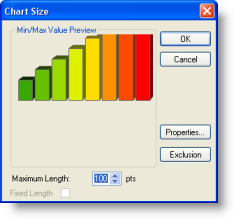
This will display a small dialog box to set the maximum length of the bars in your chart using points. 

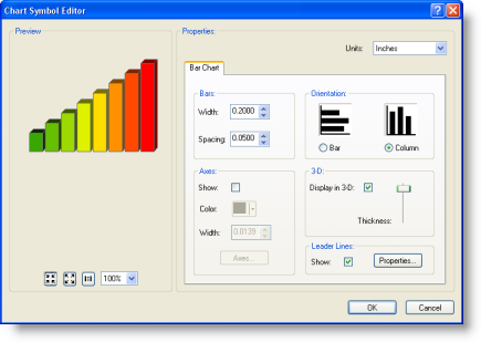
Note that when you set this value, it will also scale the current bar width and bar spacing. You can use Properties to set these values. 
You can use the Chart Symbol Editor to set the bar dimensions, the type of chart (bar or column), and other display properties.
