Available with Geostatistical Analyst license.
When you perform a classification, you group similar features into classes by assigning the same symbol to each member of the class. Aggregating features into classes allows you to spot patterns in the data more easily. The definition of a class range determines which features fall into that class and affect the appearance of the map. By altering the class breaks (the boundary between classes), you can create very different-looking maps. Classes can be created manually, or you can use a standard classification scheme.
Why set your class ranges manually?
Create classes manually if you are looking for features that meet a specific criterion or if you are comparing features to specific, meaningful values. To do this, you would manually specify the upper and lower limit for each class.
You might also manually classify data to emphasize a particular range of values, such as those above or below a threshold value. For example, you may want to emphasize areas below a certain elevation level that are susceptible to flooding.
Manual assignment of classes can also be a useful technique for isolating and highlighting ranges of data. For example, if your dataset has an overall range of 0.0465 to 0.1736 and you want to isolate the higher values, you could manually assign all values below 0.15 to one class and all values above to a second class.

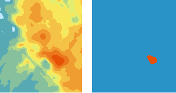
The diagram shows how selected ranges of data can be highlighted using a manual assignment of classes.
Using a standard classification scheme
How class ranges and breaks are defined determines the amount of data that falls into each class and the appearance of the map. There are two main components in a classification scheme: the number of classes into which the data is to be organized and the method by which classes are assigned. The number of classes is dependent on the objective of the analysis. The rules by which the data is assigned to a class, however, require a bit of explanation. For a geostatistical layer, there are three standard ways in which data can be assigned to classes:
- Equal interval
- Quantile
- Geometric intervals
Equal interval
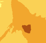
The range of possible values is divided into equal-sized intervals. Because there are usually fewer endpoints at the extremes, the numbers of values are less in the extreme classes. This option is useful to highlight changes in the extremes. It is probably best applied to familiar data ranges such as percentages or temperature.

Quantile
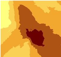
The range of possible values is divided into unequal-sized intervals so that the number of values is the same in each class. Classes at the extremes and middle have the same number of values. Because the intervals are generally wider at the extremes, this option is useful to highlight changes in the middle values of the distribution.

Geometric intervals
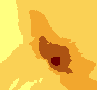
This classification scheme creates class breaks based on class intervals that have a geometrical series. The geometric coefficient in this classifier can change once (to its inverse) to optimize the class ranges. The algorithm creates geometric intervals by minimizing the sum of squares of the number of elements in each class. This ensures that each class range has approximately the same number of values with each class and that the change between intervals is fairly consistent.

This algorithm was specifically designed to accommodate continuous data. It is a compromise method between equal interval, Natural Breaks (Jenks), and quantile. It creates a balance between highlighting changes in the middle values and the extreme values, thereby producing a result that is visually appealing and cartographically comprehensive.
One example for using the Geometrical Interval classification could be with a rainfall dataset in which only 15 out of 100 weather stations (less than 50 percent) have recorded precipitation and the rest have no recorded precipitation, so their attribute values are zero.