Available with Geostatistical Analyst license.
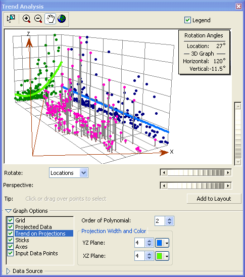
The Trend Analysis tool raises the points above a plot of the study site to the height of the values of the attribute of interest in a three-dimensional plot of the study area. The points are then projected in two directions (by default, north and west) onto planes that are perpendicular to the map plane. A polynomial curve is fit to each projection. The entire map surface can be rotated in any direction, which also changes the direction represented by the projected planes. If the curve through the projected points is flat, no trend exists, as shown by the blue line in the illustration below.

If there is a definite pattern to the polynomial, such as an upward curve as shown by the green line in the illustration above, this suggests that there is a trend in the data.
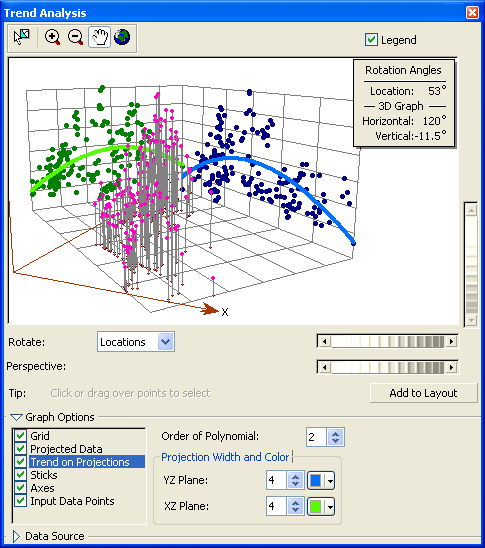
In the example below, the trend is accentuated, and it demonstrates a strong upside-down U shape. This suggests that a second-order polynomial can be fit to the data. Through the refinement allowed in the Trend Analysis tool, the true direction of the trend can be identified. In this case, its strongest influence is from the center of the region toward all the borders (that is, the highest values occur in the center of the region, and lower values occur near the edges).
