You can display a layer using a field to map by category and a quantity field. For example, you might display a road network using one attribute to represent the type of road and another representing the traffic volume. You could use line colors to represent road types and use line width to indicate traffic volume along each road.
Symbolizing your data this way allows you to display more information. However, it can also make your map more difficult to interpret. Most frequently, it's better to create two separate displays rather than try to display the information together.
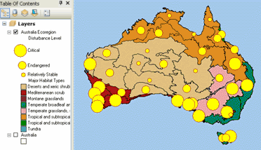
The map below shows the level of human impact on the natural landscape of Australia. Major habitat types are shown with unique colors, and the level of human impact for each habitat is shown using a graduated symbol.

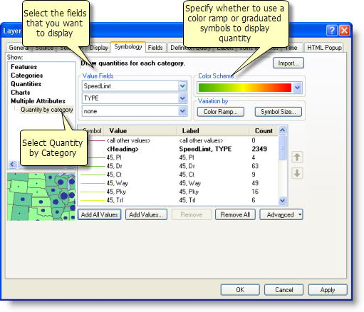
- Right-click the layer you want to draw showing quantity by category and click Properties.
- Click the Symbology tab on the Layer Properties dialog box.
- Click Multiple attributes.
- Select the Value Fields that you want to map.
- Click the desired Color Scheme from the drop-down list.
- Click Add All Values.
- Click Symbol Size or Color Ramp, depending on how you want to symbolize the quantitative value.
The example above uses Symbol Size.
- Depending on whether you selected Color Ramp or Symbol Size, the Draw quantities using color to show values or the Draw quantities using symbol size to show relative values dialog box will open. Click the Value drop-down arrow and click the quantitative value you want to map. Set other options for drawing features to show quantities.
- Click OK.
ArcMap automatically selects the Quantity by category option.
