Mit der Geostatistical Analyst-Lizenz verfügbar.
Often, the spatial locations of your data are not randomly or regularly spaced. For various reasons, the data may have been sampled preferentially, with a higher density of sample points in some places than in others. It is important for proper implementation of normal score transformation and the histogram (and also the cumulative distribution) of the sample to properly reflect the histogram of the whole population. If data is preferentially sampled when it is spatially autocorrelated, the resulting histogram from the sample may not reflect the histogram of the population.

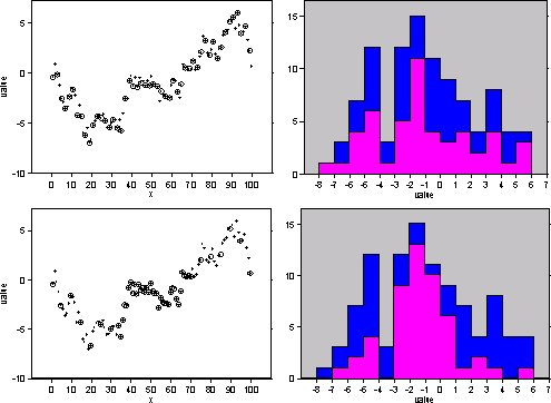
In the upper left figure in the declustering sample, the whole population of values at 100 locations along a line are given as solid circles. These were simulated from a spatially autocorrelated process with a constant mean and strong positive autocorrelation. The sampled data is every other point beginning with the first one and is shown with circles. To the right in the declustering sample, the histogram of the population is given in blue, and the histogram of the sample is given in violet.
Because the sample is half of the whole population, you would expect the sample histogram bars to be approximately half as high as for the population, with some variation. In the lower left, the data is preferentially sampled, with samples occurring at every fifth location up to location 34, then every location up to location 70, then every fifth location again to the end. The end result is, again, that half of the whole population is sampled. The preferential sampling toward the middle of the spatial locations causes a higher proportion of the middle data values to occur in the sample, so the histogram bars are nearly equal to the population bars for values ranging from -3 to 1. In conjunction with this, the lower and higher values are underrepresented in the sample histogram.
One solution to preferential sampling is to weight the data, with data in densely sampled areas receiving less weight (which would shrink the sample histogram bars for the values between -3 and 1 in the preferentially sampled example above) and data in sparsely sampled areas receiving greater weight (which would expand the sample histogram bars at the lower and higher data values). Geostatistical Analyst allows two methods. The default method is cell declustering. In cell declustering, rectangular cells are arranged over the data locations in a grid, and the weight attached to each data location is inversely proportional to the number of data points in its cell.
Choosing the grid size and orientation is all that remains. Geostatistical Analyst provides a graph that shows the weighted mean value among all the data for various cell sizes. It has been suggested to choose the cell size corresponding to the minimum weighted mean if the data has been preferentially sampled in areas of high values and, conversely, choose the cell size corresponding to the maximum weighted mean if the data has been preferentially sampled in areas of low values.
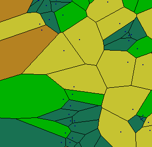
Another scheme uses a polygonal method that defines a polygon around each spatial data location such that all locations within that polygon are closer to the data location than any other data location, as shown in the following figure.

The data locations are shown as small dots, and the polygons are drawn around them, with color shading indicating the size of the polygons. The idea is to weight each data location in proportion to the area that it "represents." The problem with this method is that it is difficult to define weights toward the edge. The edge points can often receive large weights unless a border encloses the data. In Geostatistical Analyst, the border is a rectangle, which often gives too much weight to edge locations.
Learn more about declustering to adjust for preferential sampling
Feedback zu diesem Thema?