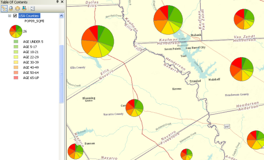
Pie charts are useful for illustrating how individual parts contribute to an overall whole set. They help when there are only a few categories. This map shows you the relative proportion of people in particular age classes by county. Younger age classes are shown in green.
- Right-click the layer you want to draw showing quantitative values using pie charts and click Properties.
- Click the Symbology tab on the Layer Properties dialog box.
- Click Charts and click Pie.
- Under Field Selection, click the numeric field(s) that you want to map. Then, use the arrow buttons to add and remove fields in the field list.
- Use the Color Scheme drop-down list to select the color ramp that you want to use.
- If you want to prevent overlapping charts, check the Prevent chart overlap box.
- Optionally, you can click the Exclusion button and use a SQL expression to exclude values (such as outliers).
- Click Size.
- Click OK.
The Pie chart properties panel will appear, in which you set the display properties, such as field names, color ramps, and so on, to generate the pie charts for each feature in your layer. 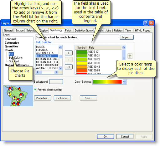

You can double-click an individual symbol in the list to change its properties.
This will display the Pie Chart Size dialog box to set the maximum length of the bars in your chart using points. 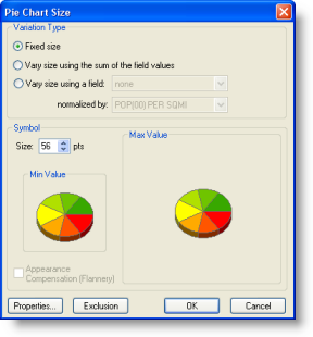

Note that when you set this value, it will also scale the current chart's width. Click Properties to open the Chart Symbol Editor dialog box and set these values. 
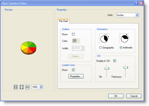
You can use the Chart Symbol Editor to set the pie chart dimensions, the orientation (bar or column), and other display properties.
