Available with Geostatistical Analyst license.
The first step for any analysis is to map and examine the data. This provides you with a first look at the spatial components of the dataset and may give indications of outliers and erroneous data values, global trends, and the dominant directions of spatial autocorrelation, among other factors, all of which are important in the development of an interpolation model that accurately reflects the phenomenon you are interested in.
ArcGIS offers many ways to visualize data: ArcMap provides access to many classification schemes and color ramps, which can be used to highlight different aspects of the data, whereas ArcScene allows the data to be rendered in 3D space, which is useful when looking for local outliers and global trends. While there is no one correct way to display the data, the following figures illustrate different renderings of the same data that allow different aspects of interest to be seen. For more detailed information on classification schemes available in ArcGIS, see Classifying numerical fields for graduated symbols.
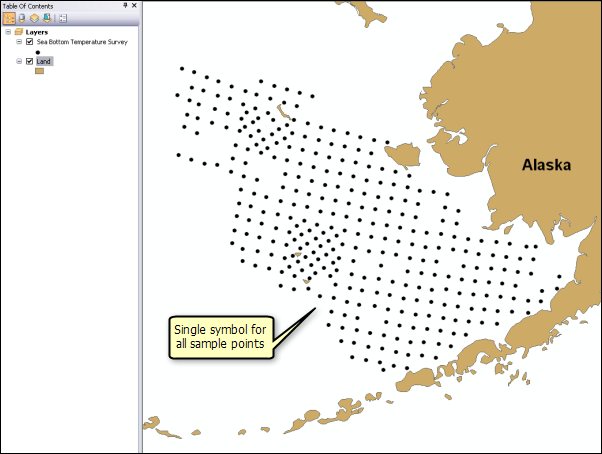
The initial view of the data provided by ArcMap uses the same symbol for all the sample points. This view provides information on the spatial extent of the samples, coverage of the study area (if a boundary is available), and indicates whether there were areas that were more heavily or intensely sampled than others (called preferential sampling). In some interpolation models (specifically simple kriging models built as a basis for geostatistical simulation and disjunctive kriging models), it is important to use a declustering technique (see Implementing declustering to adjust for preferential sampling) to obtain a dataset that is representative of the phenomenon and is not affected by oversampling in high- or low-valued regions of the study area.
A second step in mapping the data is to use a classification scheme and color ramp that show data values and their spatial relationship. By default, ArcMap will apply a natural breaks classification to the data. This is shown in the following figure, which uses five classes and a color scheme with blue for cold water temperatures and red for warmer water temperatures.
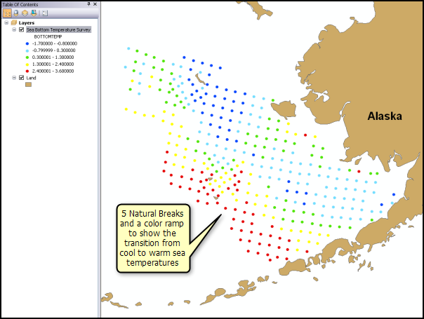
Natural breaks looks for statistically large differences between adjacent pairs of data (the data is sorted by value, not by location). In this case, warmer temperatures occur on the westernmost samples, while those in the center of the study area are colder. Samples closest to mainland Alaska show warmer temperatures. The map also shows that temperatures are fairly constant along lines going from the northwest to the southeast. These two findings can be interpreted as a trough of colder water in the center of the sampled area, which runs from the northwest toward the southeast. This is a global trend in the data and can be modeled as a second order polynomial using global polynomial interpolation or local polynomial interpolation or as a trend in kriging.
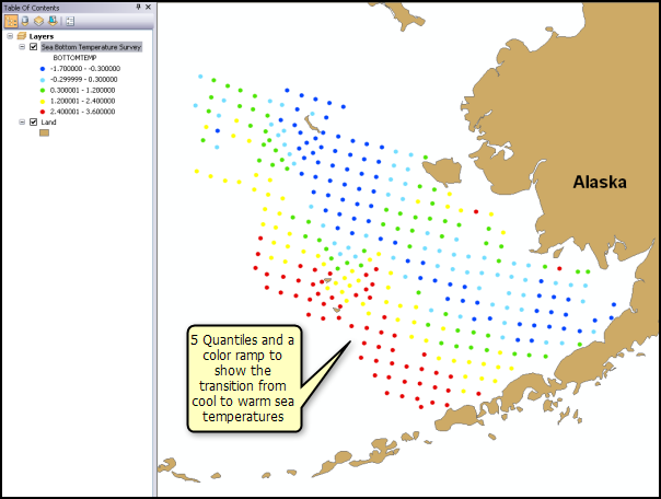
Other methods that can be used to classify the data are equal interval (which uses classes of equal width) and quantile (which breaks the data into classes that all have the same number of data values). Both of these classifications are shown below and essentially show the same spatial features as the natural breaks classification for this dataset.

A different view of the data is provided by a classification based on the statistical distribution of the data values. This rendering can be helpful in identifying outliers and erroneous data. The following figure uses the standard deviation classification and a color ramp that shows positive deviations from the mean in red and negative deviations from the mean in blue.
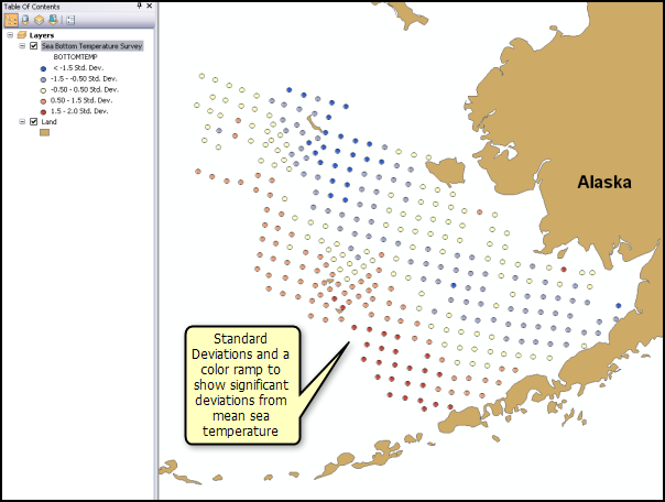
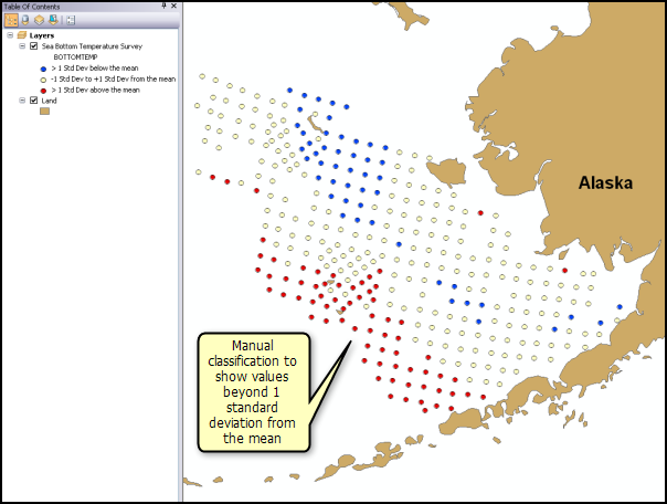
This classification refines the preliminary assessment: positive deviations from the mean occur in the westernmost samples, while in the center of the sampled area, there is a zone of colder temperatures (negative deviations from the mean) running from the northwest to the southeast. Samples closest to the Alaskan mainland do not deviate much from the mean (shown in yellow). The standard deviation classification can be adjusted manually to represent a more common approach to finding outlying values: the class breaks are adjusted to show values that deviate more than one standard deviation from the mean. The central portion of the data (that is, values that fall between the mean minus one standard deviation and the mean plus one standard deviation) will contain 64 percent of the data values if the data is normally (Gaussian) distributed. This adjusted classification is shown below and shows more clearly those values that deviate significantly from the mean. In this case, the standard deviation classification confirms what was observed in using the natural breaks, equal interval, and quantile classifications.
In visually exploring the data, it may be worthwhile to investigate how the number of classes affects the rendering of the data. The number of classes should be sufficient to show local detail in the data values but not so many that general features would be hidden. For the data used in these examples, five classes were adequate. Nine classes did not add much to the maps and made interpreting the main spatial features less straightforward.