Available with Geostatistical Analyst license.
Before you start this exercise, you should have completed exercise 1 and exercise 3.
Using the Geostatistical Analyst, you can compare the predictions displayed in two or more mapped surfaces. This allows you to make an informed decision as to which model provides more accurate predictions of ozone concentration based on cross-validation statistics.
In this exercise, you will be comparing the Trend Removed layer created in exercise 3 with the Default Kriging layer you created in exercise 1.
- If you closed your previous ArcMap session, start the program again and open Ozone Prediction Map.mxd.
-
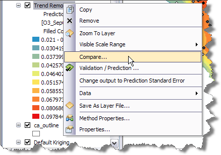
Right-click the Trend Removed layer and select Compare.

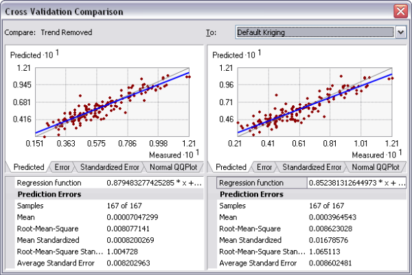
The Cross Validation Comparison dialog box will appear and automatically compare the Trend Removed model to the Default Kriging model (as it is the only other model in the table of contents).

- Compare the cross-validation statistics for both models.
Choose the best one considering that
- The predictions should be unbiased, indicated by a mean prediction error as close to 0 as possible.
- The standard errors are accurate, indicated by a root-mean-square standardized prediction error close to 1.
- The predictions do not deviate much from the measured values, indicated by root-mean-square error and average standard error that are as small as possible.
You can also use the Predicted, Error, Standardized Error, and Normal QQPlot tabs to see graphical representations of the performance of each model.
Based on these criteria, the Trend Removed model performs better than Default Kriging.
- Close the Cross Validation Comparison dialog box.
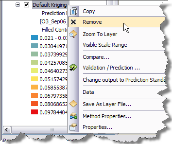
- Right-click the Default Kriging layer and click Remove.

- Click Save on the Standard toolbar.
You have now identified the best of two prediction surfaces, but you might want to create other types of surfaces to support your analysis of the phenomenon and any decision you may need to make based on the interpolated values.
In exercise 5, you will use indicator kriging to calculate the probability that a critical ozone threshold value was exceeded and generate a final map showing all the surfaces you have created in this tutorial.