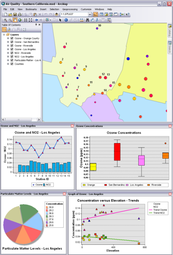
You can create graphs in ArcGIS Desktop applications to visualize and explore data. Graphs assist you in presenting information about map features and the relationship between them in a visual, easy-to-understand manner. Graphs may also be created for nonspatial tabular data and can show both additional information about the features on the map or the same information in a different way. Graphs are complementary to maps in that they simply and visually convey information that would generally be summarized numerically or explored from tables. With a graph, it is easy to quickly compare features to gain insight into the functional relationship between the features and thereby visualize the distribution, trends, and patterns in the data that otherwise would be difficult to see.
Typical graphs are drawn on a Cartesian grid whose scales are shown on two perpendicular axes, x and y. Typically, an independent variable is represented on the horizontal (x-axis) and a dependent variable on the vertical (y-axis). The perpendicular axes intersect at a point called the origin and are calibrated in the units of the quantities represented by the data values. Each data point displayed on the graph is defined by the intersection of the values from two (or more) fields in the data source.
Keep in mind that a data point doesn't necessarily appear as a point (or dot) on a graph. Depending on the type of graph, a single data point may be represented by a dot, a line, a rectangle, or some other graphic. With certain types of graphs, the data values may be represented as an area or part of a circle. See types of graphs for more information on the graphs you can create in ArcGIS Desktop applications—ArcMap, ArcGlobe, and ArcScene.
Learn more about creating graphs

The color of the data values in the graphs can be managed in several ways. The normal behavior is that the colors will match the symbology of the layer from which the graph is derived. A single color can be specified for all the values. A selection of predefined palettes can also be used. The latter two methods are how color can be applied to tabular data, since tables do not have any symbology to obtain color information from. For more information, see Setting the colors of a graph.
Once created, you can easily add a graph to your map and print it. You can also export graphs as images.