By creating a graph from your data (layer or table), you can visualize the changes in the graph or underlying data over time by simply enabling time on your data.
Learn more about enabling time on your data
There are numerous graph types, such as bar, line, area, and scatterplot graphs, that can be used for visualizing your temporal data. The type of graph you use depends on your data and how you want to visualize it over time.
Learn about the graph types that are available
Common examples of graphs to animate data through time include these:
- Attributes are plotted on the y-axis and time on the x-axis (or vice versa)
Examples include a line graph with streamflow on the y-axis and time plotted on the x-axis, or a scatterplot graph as in the example graphic below, with water, gas, and oil production plotted as three series on the y-axis and time plotted on the x-axis.
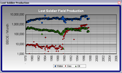
- Attributes are plotted on the x- and y-axis
Examples include a bar graph with population or disease on the y-axis and country on the x-axis. In the graphic below, the state name is plotted on the x-axis and population on the y-axis. Since there are repeating features (states) for different times, this is represented on the bar graph.
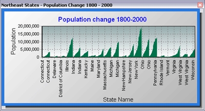
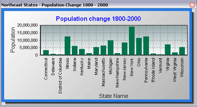
When the layer or table used to create the graph above is time-enabled, and is visualized over time using the time slider, the graph will only show one bar per state for each sequential time slice. For example, in the graphic below, the population value for the year 2000 is displayed for each state.
Learn more about creating graphs
The layer or table used to create the graph must be time-enabled to visualize the changes in the graph you created.
Learn about enabling time on your data
Tips for animating graphs
There are a number of settings within the graphing framework that you can set before animating the data in the graph. By right-clicking a graph and clicking Advanced Properties, you'll access the Editing dialog box where you can fine-tune your graph.
- To fit more date labels in the graph, make date labels appear vertically rather than horizontally along the bottom axis by setting the angle to 90 degrees.
The Minimum separation option allows you to set the amount of minimum distance between axis labels as a percentage. You can set the minimum separation value to 0 so there is no separation between axis labels. All your labels will remain when you make the graph smaller in width, but the distance between labels will decrease.
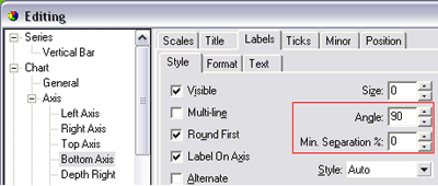
- You can specify the range of values to plot for a particular axis by setting the minimum and maximum values; click Change on the Minimum and Maximum tabs.
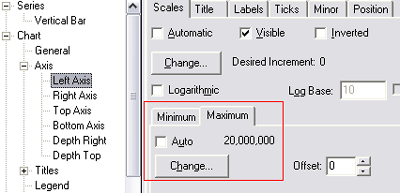
- If you want to stop the axis range from changing through the time visualization, uncheck Auto on both the Minimum and Maximum tabs.
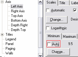
- To stop time labels from being added to the graph as the current time changes, uncheck Auto for the Minimum and Maximum value on the axis containing time labels. This enables you to see the entire time range on the axis while animating.
- With some graphs, such as line graphs, when the time visualization is played, you might want to retain the values that are plotted sequentially through time on the graph rather than only displaying the time values that fall within the current time extent. When enabling time on the data, check the Display data cumulatively check box on the Time tab of either the Layer or Table Properties dialog box.