Data has both a spatial and a temporal context: everything happens someplace and occurs at some point in time. Several tools, including Hot Spot Analysis, Cluster and Outlier Analysis, Emerging Hot Spot Analysis, and Grouping Analysis, allow you to usefully exploit those aspects of your data. When you consider both the spatial and the temporal context of your data, you can answer questions like the following:
- Where are the space-time crime hot spots? If you are a crime analyst, you might use the results from a space-time Hot Spot Analysis to make sure that your police resources are allocated as effectively as possible. You want those resources to be in the right places at the right times.
- Where are the spending anomalies? In an effort to identify fraud, you might use Cluster and Outlier Analysis to scrutinize spending behaviors looking for outliers in space and time. A sudden change in spending patterns or frequency could suggest suspicious activity.
- What are the characteristics of bacteria outbreaks? Suppose you are studying salmonella samples taken from dairy farms in your state. To characterize individual outbreaks, you can run Grouping Analysis on your sample data, constraining group membership in both space and time. Samples close in time and space are most likely to be associated with the same outbreak.
- Were your decisions or resource allocations effective? Suppose you wanted to monitor the effectiveness of new policies put in place to decrease drug crimes in your city. You could use Emerging Hot Spots to monitor changes in event data trends like identifying locations representing new, intensifying, or diminishing hot spots for where drug crimes occur.
Several tools in the Spatial Statistics toolbox work by assessing each feature within the context of their neighboring features. When neighbor relationships are defined in terms of both space and time, traditional spatial analyses become space-time analyses. To define neighbor relationships using both spatial and temporal aspects of your data, use the Generate Spatial Weights Matrix tool and select the SPACE_TIME_WINDOW option for the Conceptualization of Spatial Relationships parameter. Then specify both a Threshold Distance and a time interval (Date/Time Interval Type and Date/Time Interval Value). If, for example, you provide a distance of 1 kilometer and a time interval of 7 days, features found within 1 kilometer that also have a date/time stamp within 7 days of each other will be analyzed together. Similarly, proximal features within 1 kilometer of each other that do not fall within the 7-day time interval of each other will not be considered neighboring features.
Beyond time snapshots
One common approach to understanding spatial and temporal trends in your data is to break it up into a series of time snapshots. You might, for example, create separate datasets for week one, week two, week three, week four, and week five. You could then analyze each week separately and present the results of your analysis as either a series of maps or as an animation. While this is an effective way to show trends, how you decide to break up the data is somewhat arbitrary. If you are analyzing your data week to week, for example, how do you decide where the break falls? Should you break the data between Sunday and Monday? Perhaps Monday through Thursday, and then again Friday through Sunday? And is there something special about analyzing the data in week-long intervals? Might not daily analysis or monthly analysis be more effective? The implications might be important if the division (dividing Sunday events from Monday events, for example) separates features that really should be related. In the example below, 6 features fall within a 1 km and 7-day space-time window of the feature labeled Jan 31; only one feature will be included as a neighbor, however, if the data is analyzed using monthly snapshots.
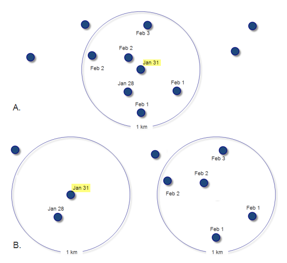
When you define feature relationships using the SPACE_TIME_WINDOW, you are not creating snapshots of the data. Instead, all the data is used in the analysis. Features that are near each other in space and time will be analyzed together, because all feature relationships are assessed relative to the location and time stamp of the target feature; in the example above (A.), a 1 km, 7-day space-time window finds six neighbors for the feature labeled Jan 31.
Suppose you were analyzing wildfires in a region. If you were to run the Hot Spot Analysis tool using the default FIXED_DISTANCE_BAND conceptualization to define feature relationships, the result would be a map showing you locations of statistically significant wildfire hot spots and cold spots. If you then ran the analysis again, but this time defined spatial relationships in terms of a SPACE_TIME_WINDOW, you may find that some of the hot spot areas are seasonal. Understanding this temporal characteristic of wildfires can have important implications for how you allocate fire resources.
Visualizing space-time results
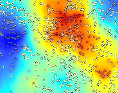
Heat maps typically show high-intensity areas (hot spots) in red and low-intensity areas (cold spots) in blue. In the graphic below, for example, the red areas are places getting the largest number of 911 emergency calls. The blue areas are locations getting relatively few calls. How might you add information about the temporal dimension of 911 call frequencies to the map below? How might you effectively map things like individual outbreaks, a series of crime sprees, reverberations in the adoption of a new technology, or the seasonal oscillations of storm patterns?
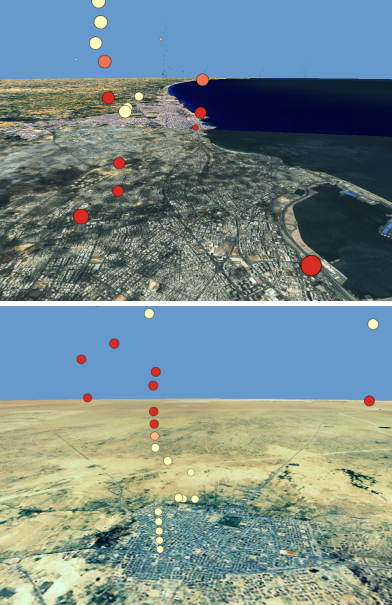
Representing three-dimensional data (x and y location, plus time) is difficult to do with a two-dimensional map. Notice that in the example below, you can't discern that there are two distinct hot spots (near each other in space, but separated by time) until the data is viewed in three dimensions. By extruding the features based on a time field, it becomes clearer which features are related and which are separated by time.
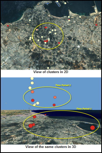
There are at least two ways to visualize the output from space-time analyses. Three-dimensional visualization is effective with a smaller study area when you have a limited number of features; this approach allows you to present space-time relationships in a single map. Another powerful method for portraying space-time processes is through animation. The examples below focus specifically on visualization of space-time clusters.
Animation
To animate your space-time clusters, enable time on your result features, open the Time Slider from the Tools toolbar, and click Play  . Set a time window that will allow you to see enough of your data at one time in a single step. If you are new to creating animations, follow the links below.
3D
Another powerful way to visualize the results of a space-time cluster analysis is to use 3D visualization. With this method, time becomes the third dimension, with point features extruded to reflect temporal progression. In the 3D graphic above, for example, the oldest events are nearest to the ground, and the more recent events hover at higher elevations (appearing closer to the viewer).
You can create a 3D representation of your data like the one above using either ArcGlobe or ArcGIS Pro. Below are instructions for visualizing your space-time cluster analysis results in ArcGIS Pro.
First, run your space-time cluster analysis in ArcGIS Pro. You can then visualize the output by following these steps:
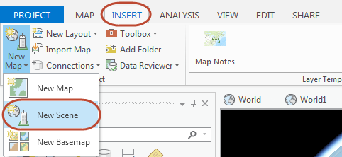
- Open a scene. To open a scene, go to the Insert tab, click New Map, and choose New Scene.
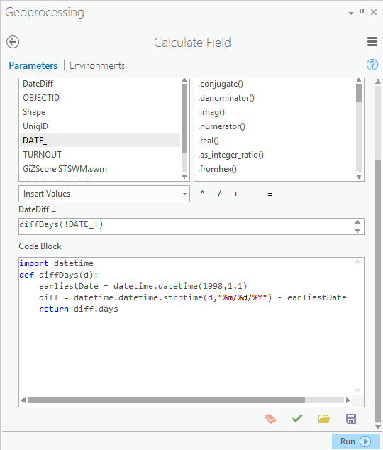
Open the attribute table of your output feature layer and sort your features by date so that you can identify the earliest date. Create a new field called DateDiff to calculate the time lapse values that will be used to project the height of each feature. For this example, the heights will be based on the number of days that have passed since the first event in the dataset occurred.
You will use a Python script to calculate the time lapse values. Right-click the new field that you just created and choose Calculate Field. From the Geoprocessing pane, fill out the parameters and code block as shown below replacing the date in the code block with the earliest date for the features in your output feature layer.
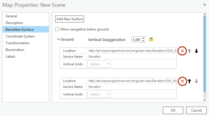
- Set the elevation surface to zero. Because time is used as the vertical axis in visualizing your output, it is important for accurate interpretation to give all of the features the same baseline height. To do this, the default elevation services need to be shut off. To turn off elevation services, right-click the new scene in the Contents pane and click Properties. Browse to the Elevation Surface tab, expand Ground, and remove the elevation services that are used by default.
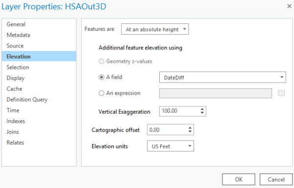
- Right click on the output feature layer, select Properties and find the Elevation tab. Change the setting for the Features are parameter to At an absolute height and set the field to be the DateDiff field you created. You will likely need to experiment with different Vertical Exaggeration values to create the visualization that works best for you.
See Navigation in ArcGIS Pro to learn more about navigating and exploring your 3D scene.
