Disponible con una licencia de Geostatistical Analyst.
Before you start this exercise, you should have completed exercise 1.
In this exercise, you will explore your data. As the structured process shown at the end of exercise 1 suggests, to make better decisions when creating a surface, you should first explore your dataset to gain a better understanding of it. When exploring your data, look for obvious errors in the values that may drastically affect the output prediction surface; examine how the data is distributed; and look for global trends, directional influences, and so forth.
Geostatistical Analyst provides many data exploration tools. In this exercise, you will explore your data in three ways:
- Examine the distribution of your data.
- Identify the trends in your data, if any.
- Understand the spatial autocorrelation and directional influences.
Examine the distribution of your data using the Histogram tool
The interpolation methods that are used to generate a surface give the best results if the data is normally distributed (a bell-shaped curve). If your data is skewed (lopsided), you might choose to transform the data to make it normal. Thus, it is important to understand the distribution of your data before creating a surface. The Histogram tool plots frequency histograms for the attributes in the dataset, enabling you to examine the univariate (one-variable) distribution for each attribute in the dataset. Next, you will explore the distribution of ozone for the O3_Sep06_3pm layer.
- If you closed your previous ArcMap session, start the program again and open Ozone Prediction Map.mxd.
- Click the ca_outline layer and drag it under the O3_Sep06_3pm layer in the table of contents.
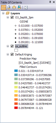
Table of contents example - Click the O3_Sep06_3pm layer to select it.
- On the Geostatistical Analyst toolbar, click Geostatistical Analyst > Explore Data > Histogram.
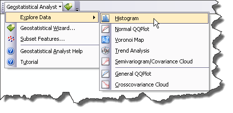
Histogram on the Explore Data menu - On the Histogram dialog box, click the Attribute arrow and choose OZONE.
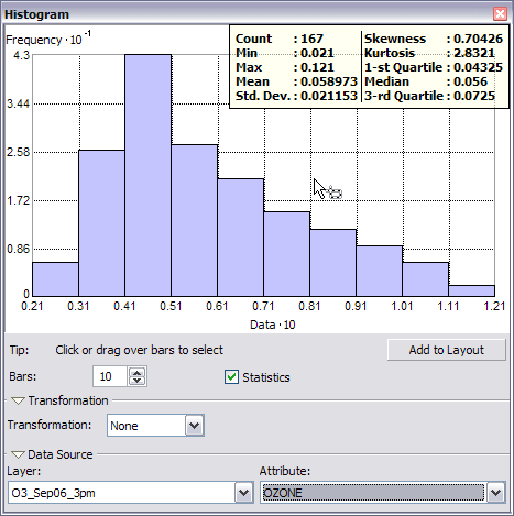
Histogram The x-axis values have been rescaled by a factor of 10 to make them easier to read. You might want to resize and move the Histogram dialog box so that you can also see the map, as shown below.
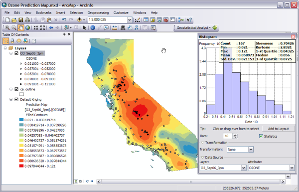
Histogram map The distribution of the ozone values is depicted in the histogram with the range of values split into 10 classes. The frequency of data within each class is represented by the height of each bar. Generally, the important features of a distribution are its central value, spread, and symmetry. As a quick check, if the mean and the median are approximately the same value, you have one piece of evidence that the data may be normally distributed.
The ozone data histogram indicates that the data is unimodal (one hump) and skewed right. The right tail of the distribution indicates the presence of a relatively small number of sample points with large ozone concentration values. It seems that the data is not close to a normal distribution.
- Select the two histogram bars with ozone values larger than 0.10 ppm (recall that the values have been rescaled by a factor of 10) by clicking and dragging the pointer over them.
The sample points within this range are selected on the map. Note that most of these sample points are located in California's Central Valley.
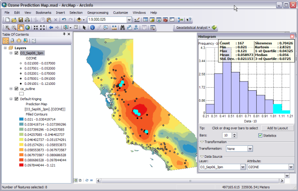
Histogram and map showing selected points - Click the Clear Selected Features button
 on the Tools toolbar to clear the selected points on the map and histogram.
 - Click the Close button located in the upper corner of the Histogram dialog box.
Create a normal QQ plot
The quantile-quantile (QQ) plot is used to compare the distribution of the data to a standard normal distribution, providing another measure of the normality of the data. The closer the points are to the straight (45-degree) line in the graph, the closer the sample data follows a normal distribution.
- On the Geostatistical Analyst toolbar, click Geostatistical Analyst > Explore Data > Normal QQPlot.
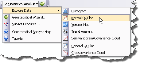
Normal QQPlot on the Explore Data menu - Click the Attribute arrow and choose OZONE.
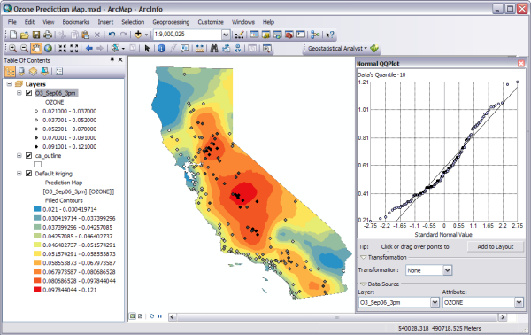
Normal QQPlot map A general QQ plot is a graph on which the quantiles from two distributions are plotted versus each other. For two identical distributions, the QQ plot will be a straight line. Therefore, it is possible to check the normality of the ozone data by plotting the quantiles of that data versus the quantiles of a standard normal distribution. From the normal QQ plot above, you can see that the plot is not very close to being a straight line. The main departure from this line occurs at low values of ozone concentration (selected and shown in green in the image above, which have been selected by clicking and dragging the pointer over them).
If the data does not exhibit a normal distribution in either the histogram or normal QQ plot, it may be necessary to transform the data to make it conform to a normal distribution before using certain kriging interpolation techniques.
- Click the Close button located in the upper corner of the Normal QQPlot dialog box.
Identify global trends in your data
If a trend exists in your data, it is a nonrandom (deterministic) component of a surface that can be represented by a mathematical formula. For instance, a gently sloping hillside can be represented by a plane. A valley would be represented by a more complex formula (a second-order polynomial) that creates a U shape. This formula may produce the representation of the surface you want. However, many times the formula produces a surface that is too smooth to accurately depict the phenomenon because no hillside is a perfect plane nor is any valley a perfect U shape. Local variation can be added to the surface by modeling the trend using one of these smooth functions, removing it from the data and continuing your analysis by modeling the residuals, which is what remains after the trend is removed. When modeling the residuals, you will be analyzing the short-range (local) variation in the surface. The Trend Analysis tool enables you to identify the presence/absence of trends in the input dataset and identify which order of polynomial fits the trend best.
- On the Geostatistical Analyst toolbar, click Geostatistical Analyst > Explore Data > Trend Analysis.
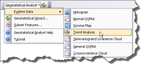
Trend Analysis on the Explore Data menu - Click the Attribute arrow and choose OZONE.
Each vertical stick in the trend analysis plot represents the location and value (height) of each ozone measurement. The data points are projected onto the perpendicular planes, an east–west and a north–south plane. A best-fit line (a polynomial) is drawn through the projected points, showing trends in specific directions. If the line were flat, this would indicate that there is no trend. However, if you look at the light green line in the image below, you can see it starts out with low values, increases as it moves toward the center of the x-axis, then decreases. Similarly, the blue line is increasing as it moves north and decreases starting from the center of the state. This demonstrates that the data seems to exhibit a strong trend from the center of the data domain in all directions.
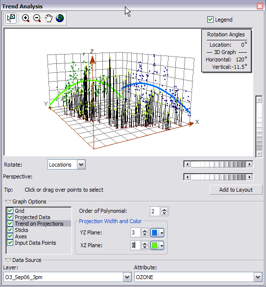
Trend Analysis plot - Click the Rotate Locations scroll bar and scroll left until the rotation angle is 90 degrees.

Rotate scroll bars You can see that while you rotate the points, the trends always exhibit upside-down U shapes. Also, the trend does not seem to be stronger (a more pronounced U shape) for any particular rotation angle, reaffirming the observation above that there is a strong trend from the center of the data domain in all directions. Because the trend is U-shaped, a second-order polynomial is a good choice to use as a global trend model. This trend is possibly caused by the fact that the pollution is low at the coast, but farther inland there are large human populations that taper off again at the mountains. You will remove these trends in exercise 4.
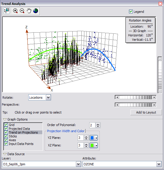
Trend Analysis plot rotated 90 degrees - Click the Close button located in the upper corner of the Trend Analysis dialog box.
Explore spatial autocorrelation and directional influences
- On the Geostatistical Analyst toolbar, click Geostatistical Analyst > Explore Data > Semivariogram/Covariance Cloud.
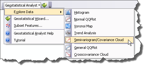
Semivariogram/Covariance Cloud on the Explore Data menu - Click the Attribute arrow and choose OZONE.
The semivariogram/covariance cloud allows you to examine the spatial autocorrelation between the measured sample points. It is generally assumed that things that are close to one another are more alike. The semivariogram/covariance cloud lets you examine this relationship. To do so, a semivariogram value, which is the difference squared between the values of each pair of locations, is plotted on the y-axis relative to the distance separating each pair of measurements, which is plotted on the x-axis.
Each red dot in the semivariogram/covariance cloud represents a pair of locations. Since locations that are close to each other should be more alike. In the semivariogram plot, the locations that are closest (on the far left on the x-axis) should have small semivariogram values (low values on the y-axis). As the distance between the pairs of locations increases (moving right on the x-axis), the semivariogram values should also increase (move up on the y-axis). However, a certain distance is reached where the cloud flattens out, indicating that the values of the pairs of points separated by more than this distance are no longer correlated.
Looking at the semivariogram, if it appears that some data locations that are close together (near zero on the x-axis) have a higher semivariogram value (high on the y-axis) than you would expect, you should investigate these pairs of locations to see if there is a possibility that the data is inaccurate.
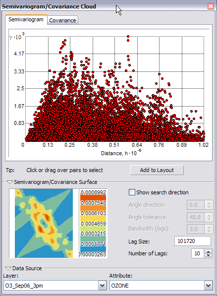
Semivariogram cloud - Click the Select Features By Rectangle button
 on the Tools toolbar, then click and drag the pointer over some points with large semivariogram (y-axis) values on the Semivariogram/Covariance Cloud dialog box to select them. (Use the diagram on the left as a guide. It is not important to select exactly the same points as those shown in the diagram below.)
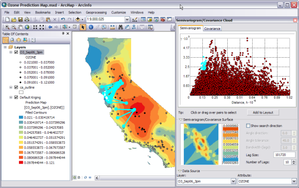
Example 1 of point selection The pairs of sample locations that are selected in the semivariogram are highlighted on the map, and lines link the locations, indicating the pairing. As it might be expected from the default kriging prediction map, the lines with high semivariogram values for a particular distance between the points in a pair are those that correspond to the largest gradient in the ozone values.
The diagram below shows pairs with typical semivariogram values for approximately the same distances between the pairs of points.
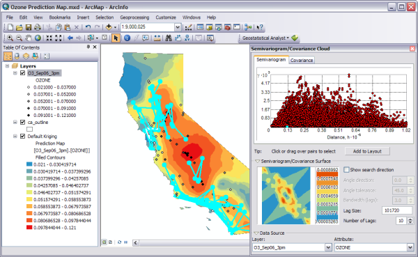
Example 2 of point selection - Check Show search direction.
- Click and move the directional pointer to any angle.
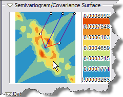
Directional pointer example The direction the pointer is facing determines which pairs of data locations are plotted on the semivariogram. For example, if the pointer is facing an east–west direction, only the pairs of data locations that are east or west of one another will be plotted on the semivariogram. This enables you to eliminate pairs you are not interested in and to explore the directional influences on the data.
- Click and drag the Select Features By Rectangle tool along the pairs with the highest semivariogram values to select them on the plot and in the map. (Use the following diagram as a guide. It is not important to select the exact points in the diagram or to use the same search direction.)
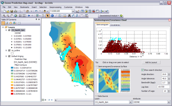
Semivariogram cloud selection example Notice that the majority of the linked locations (representing pairs of points on the map) correspond to one of the sample points from the central California region. This is because the values of ozone in this area are higher than anywhere else in California.
- Click the Close button in the upper corner of the dialog box.
- Click the Clear Selected Features button
 on the Tools toolbar to clear the selected points on the map.
In this exercise you learned
- The ozone data is unimodal but is not very close to a normal distribution as seen in the histogram.
- The normal QQ plot also shows that the data is not normally distributed, since the points in the plot do not form a straight line. A data transformation may be necessary.
- Using the Trend Analysis tool, you saw that the data exhibited a trend and, once refined, identified that the trend would be best fit by a second-order polynomial.
- The semivariogram/covariance cloud illustrated that the unusually high semivariogram values are largely represented by the lines perpendicular to the coast. The analysis using this tool indicates that the interpolation model should account for anisotropy.
- The semivariogram surface indicates there is spatial autocorrelation in the data. Knowing that there are no outlier (or erroneous) sample points in the dataset, you can proceed with confidence to the surface interpolation. You will be able to create a more accurate surface than the one you created in exercise 1 using default options and parameter values because you now know that there is trend and anisotropy in the data and you can adjust for it in the interpolation. Also, a data transformation may improve the prediction model.
In exercise 3 you will use what you have learned about the ozone data to create a better interpolation model than the one created in exercise 1, which was based on default parameter values.