Geostatistical Analyst のライセンスで利用可能。
Before you start this exercise, you should have completed exercise 2.
In exercise 1, you used the default parameters to map ozone concentration. However, you did not examine the statistical properties of the sample data. For example, from exploring the data in exercise 2, it appeared that the data exhibited a trend and a directional influence. These can be incorporated into the interpolation model.
In this exercise, you will
- Improve on the map of ozone concentration created in exercise 1.
- Be introduced to some basic geostatistical concepts.
You will again use the ordinary kriging interpolation method, but this time incorporate trend and anisotropy in your model to create better predictions. Ordinary kriging is the simplest geostatistical model because the number of assumptions behind it is the lowest.
- If you closed your previous ArcMap session, start the program again and open Ozone Prediction Map.mxd.
- Make sure that none of the points representing ozone measurements are selected. If some are, clear the selection by clicking the Clear Selected Features button
 on the Tools toolbar.
 - On the Geostatistical Analyst toolbar, click Geostatistical Analyst > Geostatistical Wizard.
- Click Kriging/Cokriging in the Methods list box.
- Click the Input data drop-down arrow and click O3_Sep06_3pm.
- Click the Attribute drop-down arrow and click the OZONE attribute.
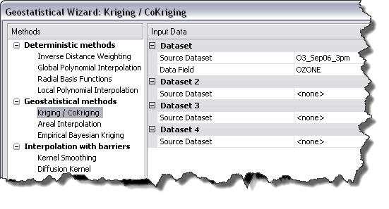
- Click Next.
- Click Ordinary Kriging.
From the exploration of your data in exercise 2, you discovered a global trend. After refinement with the Trend Analysis tool, you determined that a second-order polynomial seemed reasonable. This trend can be represented by a mathematical formula and removed from the data.
Once the trend is removed, the statistical analysis will be performed on the residuals or the short-range variation component of the surface. The trend will automatically be added back before the final surface is created so that the predictions produce meaningful results.
- Click the Order of trend removal drop-down arrow and click Second.
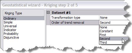
A second-order polynomial will be fitted because a U‑shaped curve was detected in the Trend Analysis dialog box in exercise 2.
- Click Next.
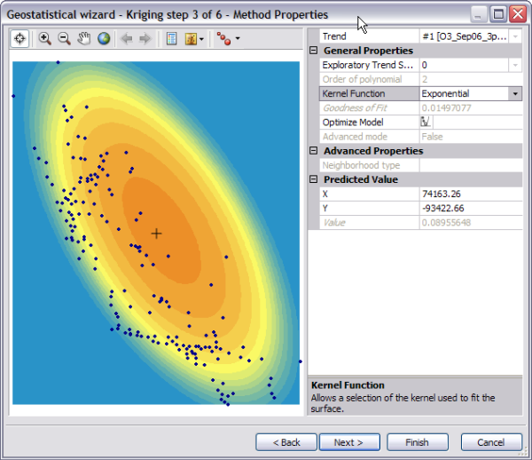
Example of Method Properties dialog of the Geostatistical wizard. By default, Geostatistical Analyst maps the global trend in the dataset. The surface indicates the most rapid change in the southwest–northeast direction and a more gradual change in the northwest–southeast direction (causing the ellipse shape).
Trends should only be removed if there is justification for doing so. The southwest–northeast trend in air quality can be attributed to an ozone buildup between the mountains and the coast. The elevation and prevailing wind direction are contributing factors to the relatively low values in the mountains and at the coast. The high concentration of humans also leads to high levels of pollution between the mountains and coast. Hence, you can justifiably remove these trends.
- Click Next on the Detrending dialog box.
Semivariogram/Covariance modeling
Using the semivariogram/covariance cloud tool in exercise 2, you explored the overall spatial autocorrelation of the measured points. To do so, you examined semivariogram values, which showed the difference squared of the ozone measurements taken at pairs of sampling locations separated by different distances. The goal of semivariogram/covariance modeling is to determine the best fit for a model that will pass through the points in the semivariogram (shown by the blue line in the diagram below). The semivariogram is a graphic representation used to provide a picture of the spatial correlation in the dataset.
The Semivariogram/Covariance Modeling dialog box allows you to fit models to the spatial relationships in the dataset. Geostatistical Analyst first determines good lag sizes for grouping semivariogram values. The lag size is the size of a distance class into which pairs of locations are grouped to reduce the large number of possible combinations. In exercise 2, the semivariogram/covariance cloud showed one red point for every pair of points in the dataset. Our goal now is to fit a curve through those points. To have a clearer picture of the semivariogram values, the empirical semivariogram values (red points) are grouped according to the separation distance they are associated with. The points are split into bins (or lags), and the lag size determines how wide each interval (bin) will be. This process is known as binning.
As a result of the binning, notice that there are fewer points in this semivariogram than in the semivariogram cloud you saw in exercise 2. The Semivariogram/Covariance Modeling dialog box displays the semivariogram values as a surface (map on the bottom left of the dialog box) and as a scatterplot relating semivariogram values to separation distance. By default, optimal parameter values are calculated for an omnidirectional (all directions) stable semivariogram model. There are several other types of semivariogram models that could be used, depending on how well they fit the data. Parameter values for the omnidirectional stable semivariogram model are the nugget, range, partial sill, and shape. You will notice that at smaller distances, the semivariogram model (blue line) rises sharply, then levels off. The range is the distance where it levels off. This flattening out of the semivariogram indicates that there is little autocorrelation in attribute (ozone) values beyond the range.
The fitting algorithm actually uses variable lag sizes, which allow the spatial autocorrelation in ozone concentrations to be captured quite well, especially at short distances (which are the most important for interpolation). Semivariogram values for these lag sizes can be exported by selecting Save geometrical values as table in the Export > Variography section of the dialog box and visualized using Excel, for example.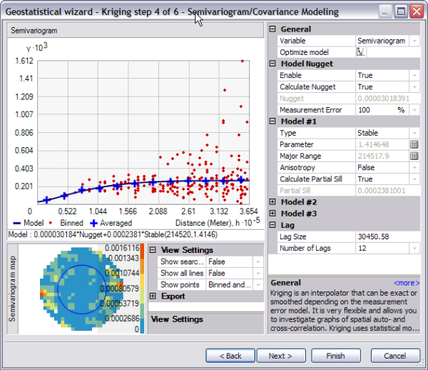
By removing the trend, the semivariogram will model the spatial autocorrelation among data points without having to consider the trend in the data. The trend will be automatically added back to the calculations before the final surface is produced.
The color scale, which represents the calculated semivariogram value, provides a direct link between the empirical semivariogram values on the graph and those on the semivariogram surface. The value of each cell in the semivariogram surface is color coded, with lower values shown in blue and green and higher values shown in orange and red. The average value for each cell of the semivariogram surface is plotted on the semivariogram graph and depicted as a red point. The average value for each lag (which encompasses many cells) is plotted on the semivariogram graph as well, and is depicted as a blue cross. The x-axis on the semivariogram graph is the distance from the center of the cell to the center of the semivariogram surface. For the ozone data, the semivariogram starts low at short distances (ozone values measured at locations that are close together are similar) and increases as distance increases (ozone values get more dissimilar the farther apart they were measured). Notice from the semivariogram surface that dissimilarity in ozone values increases more rapidly in the west–east direction than in the south–north direction. Earlier, you removed a coarse-scale trend. Now it appears that there is still a directional component to the autocorrelation, so you will incorporate that into the next model.
Directional semivariograms
A directional influence will affect the points of the semivariogram and the model that will be fit. In certain directions, things that are closer to each other may be more alike than in other directions. Geostatistical Analyst can account for directional influences, or anisotropy in the semivariogram model. Anisotropy can be caused by wind, runoff, a geological structure, or a wide variety of other processes. The directional influence can be statistically quantified and accounted for when making your map.
You can explore the dissimilarity in data points for a certain direction with the Search Direction tool. This allows you to examine directional influences on the semivariogram chart. It does not affect the output surface. The following steps show how to achieve this.
- Type a new Lag size value of 15000. Reducing the lag size means that you are zooming in to model the details of the local spatial data variation.
- Change the Show search direction option from False to True.
Note the reduction in the number of semivariogram values. Only those points in the direction of the search are shown in the graph.
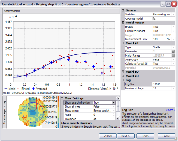
Illustration of a directional semivariogram. - Click and hold the mouse pointer on the center blue line of the Search Direction tool.
Change the search direction by dragging the center line. As you change the direction of the search, note how the semivariogram graph changes. Only the semivariogram surface values within the direction of the search are plotted on the semivariogram graph above.
To actually account for the directional influences on the semivariogram model for the surface calculations, you must calculate the anisotropical semivariogram or covariance model.
- Change the Anisotropy option from False to True.
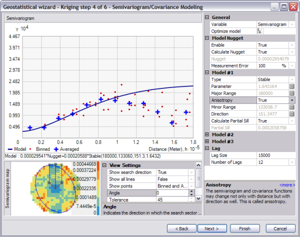
Illustration of a directional semivariogram with anisotrophy. The blue ellipse on the semivariogram surface indicates the range of the semivariogram in different directions. In this case, the major axis lies approximately in the NNW–SSE direction. Anisotropy will now be incorporated into the model to adjust for the directional influence of autocorrelation in the output surface.
- Change the search direction angle under View Settings from 0 to 61.35 to make the directional pointer coincide with the minor axis of the anisotropical ellipse.
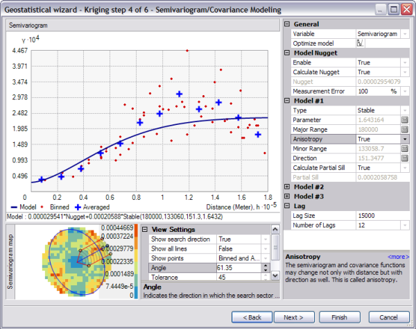
Illustration of a directional semivariogram at angle 61.35 degrees from North. Note that the shape of the semivariogram curve increases more rapidly to its sill value. The x- and y‑coordinates are in meters, so the range in this direction is approximately 110 kilometers.
- Change the search direction angle under View Settings from 61.35 to 151.35 to make the directional pointer coincide with the major axis of the anisotropical ellipse.
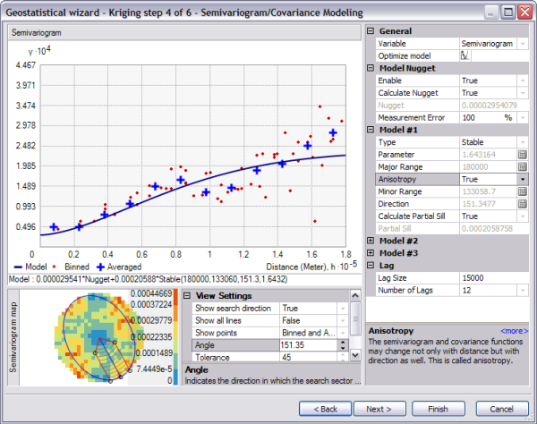
Illustration of a semivariogram in the direction of the major axis. The semivariogram model increases more gradually, then flattens out. The range in this direction is about 180 kilometers. The plateau that the semivariogram models reach in both steps 5 and 6 is the same and is known as the sill. The range is the distance at which the semivariogram model reaches its limiting value (the sill). Beyond the range, the dissimilarity between points becomes constant with increased lag distance. Points separated by distances larger than the range are spatially uncorrelated with each other.
The nugget represents measurement error and/or microscale variation (variation at spatial scales too fine to detect). It is possible to estimate the measurement error if you have multiple observations per location, or you can decompose the nugget into measurement error and microscale variation using the Measurement Error control.
- Click Next.
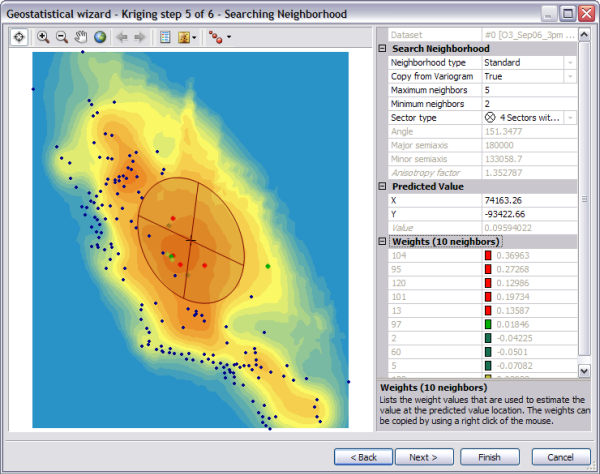
Example of the Searching Neighborhood dialog box. Now you have a fitted model to describe the spatial autocorrelation, taking into account the trend and directional influences in the data. This information, along with the configuration and measurements of locations around the prediction location, is used to make a prediction. But how should measured values be used to make the predictions?
Searching neighborhood
It is common practice to limit the data used by defining a circle (or ellipse) to enclose the points that are used to predict a value at an unmeasured location. Additionally, to avoid bias in a particular direction, the circle (or ellipse) can be divided into sectors from which an equal number of points are selected. By using the Searching Neighborhood dialog box, you can specify the number of points (a maximum of 200), the radius (or major/minor axis), and the number of sectors of the circle (or ellipse) to be used for prediction.
The points selected in the data view window indicate the weights that will be associated with each measured value to predict a value for the location marked by the crosshair. In this example, five measured values (shown in red) have weights of more than 10 percent. The larger the weight, the more impact that value will have on the prediction for the location at the crosshair.
- Click on the surface preview to select a prediction location (where the crosshairs are located). Note the change in the selection of data locations (together with their associated weights) that will be used for calculating the value at the prediction location.
- For the purpose of this exercise, under Predicted Value, type 66000 for X and -220000 for Y.
- Change the Copy from Variogram to False and type 90 in the Angle text box.
Notice how the shape of the search ellipse changes.
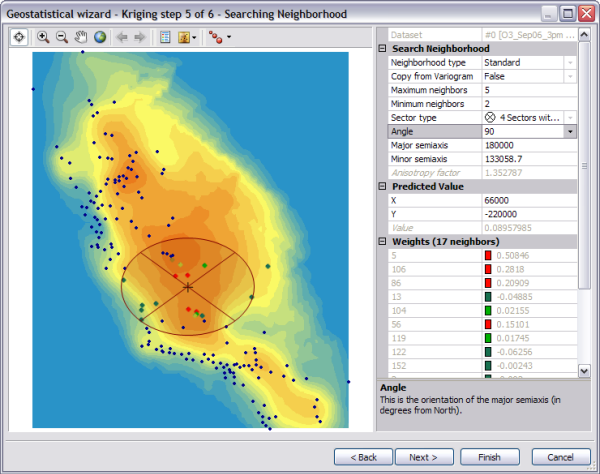
Copy from Variogram is changed from True to False and the Angle is changed to 90. However, to account for the directional influences, change the Copy from Variogram control back to True.
- Click Next.
The Cross Validation dialog box will appear.
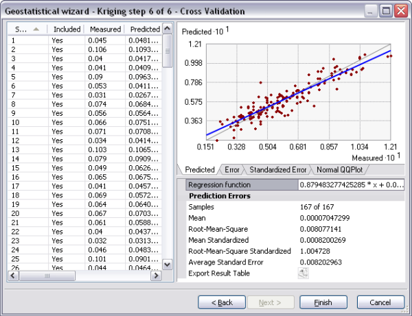
Example of Cross Validation dialog box. Before you actually create the surface, you will use the Cross Validation dialog box to perform diagnostics on the parameters to determine how good your model will be.
Cross-validation
The objective of cross-validation is to help you make an informed decision about which model provides the most accurate predictions. It gives you an idea of how well the model predicts the unknown values. Cross-validation sequentially omits a point in the dataset, predicts a value for that point's location value using the rest of the data, then compares the measured and predicted values (the difference between the measured and predicted value is known as a prediction error). The statistics calculated on the prediction errors serve as diagnostics that indicate whether the model is reasonable for decision making and map production.
To judge if a model provides accurate predictions, verify that
- The predictions are unbiased, indicated by a mean prediction error close to 0.
- The standard errors are accurate, indicated by a root-mean-square standardized prediction error close to 1.
- The predictions do not deviate much from the measured values, indicated by root-mean-square error and average standard error that are as small as possible.
The Cross Validation dialog box also allows you to display scatterplots that show the error, standardized error, and QQ plot for each data point.
- Click the Normal QQPlot tab to display the QQ plot.
From the QQPlot tab, you can see that some values fall slightly above the line and some slightly below the line, but most points fall very close to the straight dashed line, indicating that prediction errors are close to being normally distributed.
- To select the location for a particular point, click the row that relates to the point of interest in the table. The selected point is shown in green on the QQ plot.
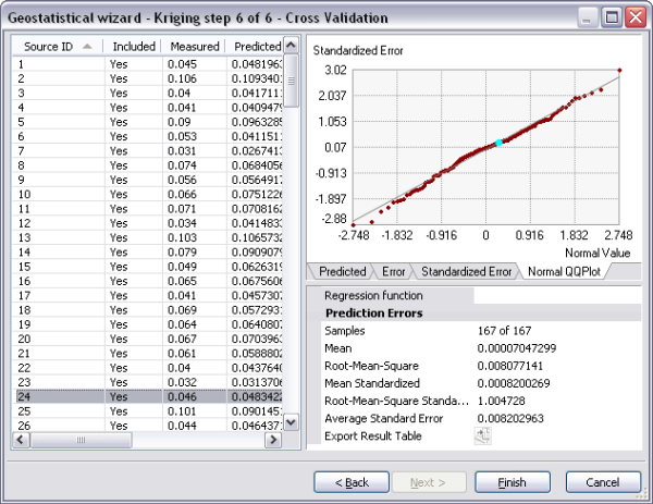
Example of selecting a particular point in the Cross Validation dialog. - Optionally, click the Export Result Table button to save a point feature class for further analysis of the results.
- Click Finish.
The Method Report dialog box provides a summary of the model that will be used to create a surface.
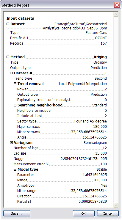
Kriging method report summary - Click OK.
The predicted ozone map will appear as the top layer in ArcMap. By default, the layer assumes the name of the interpolation method used to produce the surface (for instance, Kriging).
- Click the layer name and change the name to Trend Removed.
- To extend the prediction surface so that it covers all of California, right-click the Trend Removed layer, click Properties, then click the Extent tab. Under Set the extent to, specify the rectangular extent of ca_outline and click OK.
- Drag the O3_Sep06_3pm layer to the top of the table of contents so that you can see the points on top of the interpolated surface.
- Right-click the Trend Removed layer that you created and click Change output to Prediction Standard Error.
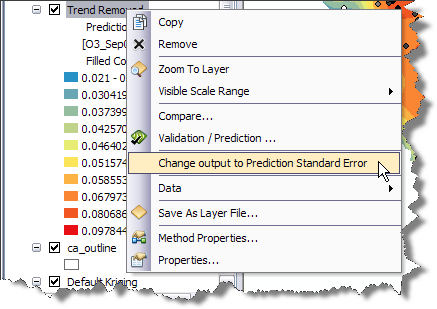
Change output to Prediction Standard Error menu 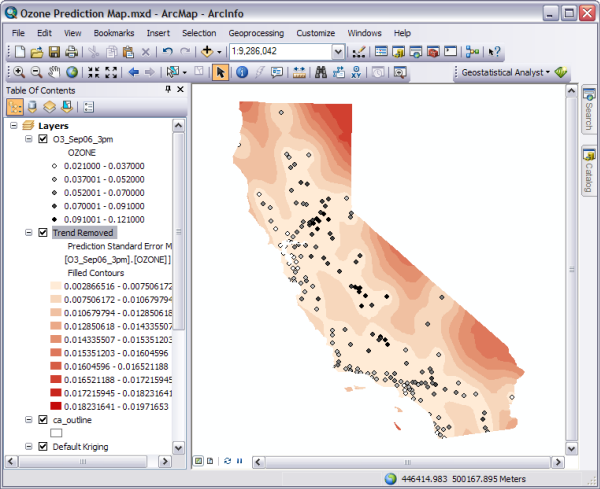
Prediction Standard Error in ArcMap - Right-click the Trend Removed layer that you created and click Change output to Prediction to get back to the ozone prediction map.
- Click Save on the Standard toolbar.
The surface you created in exercise 1 simply used the defaults of the Geostatistical Wizard, with no consideration of trends in the surface, of using smaller lag sizes, or of using an anisotropic semivariogram model. The prediction surface you created in this exercise took into consideration the global trends in the data and adjusted for the local directional influence (anisotropy) in the semivariogram.
In exercise 4, you will compare the two models to see which one provides a better prediction of unknown values.