Доступно с лицензией Business Analyst.
The Wind Rose Report is used by scientists to analyze and display distributions of wind speeds and the frequency of the varying wind directions based on meteorological observations of wind speeds and wind directions. This concept can be applied in a business GIS perspective to demonstrate patterns in customer distribution. The Wind Rose Chart divides a geocoded customer file into different geographic quadrants (N, NE, NW, S, SE, and so on). Because the sectors divide the entire distribution of customer locations around a store location, a circular buffer is created around the store that encompasses all the store points, and this circle is then divided into sectors. The number of customers in each sector is then counted.
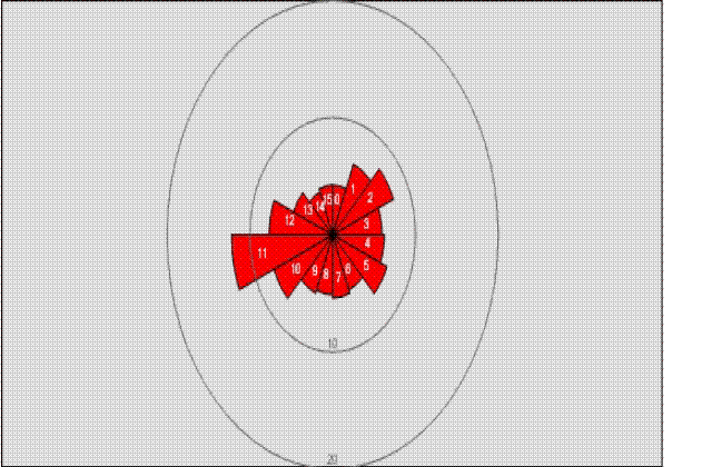
The length of each bar represents the proportion of customers that are within a given total. You should be able to define how many geographic quadrants should appear on the report. The sample graph below illustrates what a typical Wind Rose diagram looks like.

The red bars represent a proportion of the total customers in the entire file. The longer a red bar is in the graph, the greater the proportion of customers that originated from that geographic direction. This graph is used to display geographic patterns of customer behavior and can be used by marketing professionals to understand why their customers are traveling to a store.