获得 Business Analyst 许可后可用。
Segmentation Charts graphically display values for each tapestry segment when comparing two or more profiles. These charts are used to illustrate the values in a Customer Tapestry Profile Report.
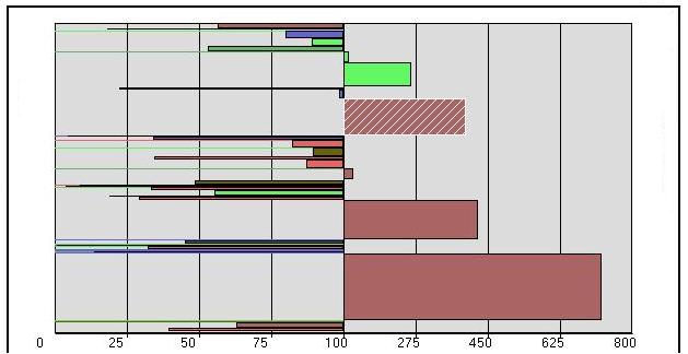
A sample profile comparison bar chart is illustrated below. The y-axis contains a bar for each of the Tapestry segments, and the x-axis is scale dependent on the index values of a profile comparison. The index estimates the propensity of a specific segment to consume the target profile. The base value of 100 is average and is a central reference point of this chart. If a segment has an index value of 100, the target profile has the same propensity to consume the target profile as the base. Therefore, a value of less than 100 indicates that the target profile consumes less than average, and a value greater than 100 indicates that the target profile consumes at a rate higher than the base.

For each profile bar chart, the y-axis crosses the x-axis at 100. Each bar within the chart displays three distinct pieces of information:
- The bar length displays the index value of the cluster segment of the profile comparison. For example, the index of the bar segment highlighted with hatching above is 437.
- The color of the bar is based on the major group to which the cluster segment belongs.
- The width of each bar is determined by the relative size of the percent penetration of the segment. Displaying the width assists you in selecting useful segments for further analysis. For example, the bar segment above that is highlighted with hatching has a high index value but may be more valuable because it represents a much higher proportion of the customer file (wider and higher penetration value). Percent penetration is calculated by dividing the target total for each segment by the base total and multiplying by 100. For example, if there were 1,000 customers in segment 06 and 100,000 households in the base, the percent penetration would be 1 percent.