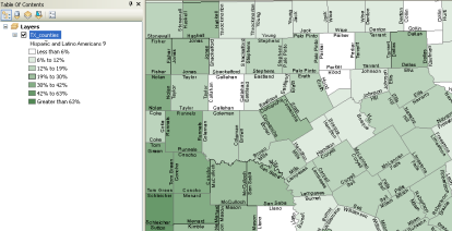
The graduated color renderer is one of the common renderer types used to represent quantitative information—especially for polygon feature classes. Using a graduated colors renderer, the quantitative values for a field are grouped into ordered classes. Within a class, all features are drawn with the same color. Each class is assigned a graduated color from smallest to largest.

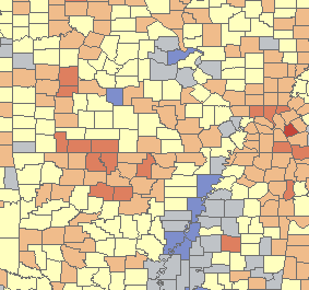
Use of graduated colors is often helpful to display value classes and how far they might be arrayed from either side of the average or median value. In the example below, a two-color ramp helps emphasize values above the mean (shown in blue) and values below the mean (shown in red).

A key design aspect in using graduated colors for a layer is about classifying numerical data. See Classifying numerical fields for graduated symbology for a good overview on the classification methods available in ArcGIS.
- Right-click the layer you want to draw using graduated colors in the table of contents and click Properties.
- Click the Symbology tab on the Layer Properties dialog box.
- Click Quantities, then click Graduated colors.

- Select the numeric field that contains the quantitative data you want to map.
- Optionally, select a Normalization field to normalize the data. The values in this field will be used to divide the Value field to create ratios.
- Select the desired color ramp and click the Classify button.
- Select the classification method you want to use and enter the number of classes you want to display. See Classifying numerical fields for graduated symbology for more information.
- Optionally, double-click a class symbol to edit its properties.
- Optionally, edit the values in the Range column. The Range column shows the actual range of values represented by each class. To edit these values manually, click on the range. This lets you edit the value of the upper end of the range for the class you clicked. When you edit the range, the classification type automatically becomes Manual. To edit the class ranges using a histogram, click the Classify button on this dialog box. Click the Range column heading for options.
- Optionally, edit the values in the Label column to be something more descriptive than the underlying class range values. To edit these values click on the label. Click the Label column heading for options.
- Click OK.
Normalization ratios are useful when other factors influence the numerical values you are classifying and displaying. For example, counts of the number of Hispanic and Latino Americans can be influenced by each county's size. You can divide this count by total population to normalize the values as proportions.