Prerequisite:
To follow this procedure and create a data clock, you must have at least one tracking layer loaded into Tracking Analyst.
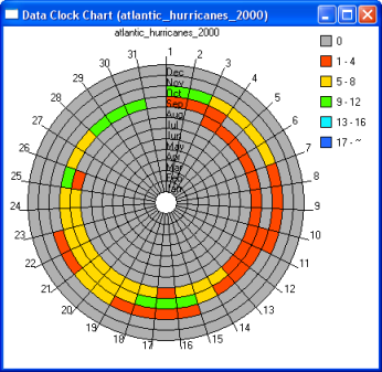
The Tracking Analyst Create Data Clock Wizard creates a circular chart of temporal data that you can use to analyze patterns in the data that you may miss when viewing the data in a table or on a map. You can modify the colors, number of classes, and legend settings to produce a temporal data chart that best fits your needs.
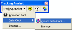
- Click Tracking Analyst on the Tracking Analyst toolbar to expand the drop-down list. Point to Data Clock and click Create Data Clock on the pull-right menu. This opens the Create Data Clock Wizard dialog box.

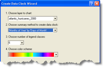
- Click the Choose layer to chart drop-down arrow and click the tracking layer for which you want to create a data clock. A complete list of the tracking layers in your map document will appear.

- Click the Choose summary method to create data clock drop-down arrow and click the method you would like Tracking Analyst to use for summarizing data in the data clock.
All the available data summary options will appear in the drop-down list, but you must understand the characteristics of your data to know which option will be the most appropriate.
- Click the Choose number of legend classes drop-down arrow and click a number from the list.
This number will determine the number of classes, each with its own color, that will appear in your data clock. The more classes you choose, the more detailed the information in the data clock will be.
- Click the Choose color scheme drop-down arrow and choose the color range to include in the data clock.
- Click the Finish button to create the data clock.

The data clock chart appears on the Data Clock Chart dialog box. Now that you have created your data clock, you can further adjust its properties by right-clicking anywhere inside the Data Clock Chart and accessing the context menu provided. You can close this dialog box when you are done viewing the data clock. To open it again, you must use the Data Clock Manager.