A vertical or horizontal bar graph is used to display discrete data in separate columns. Bar graphs compare amounts to each other and can suggest trends in the data. They have the advantage of being visually strong, and if you add additional series, they make it easy to compare the multiple columns representing data values to each other.
- Click the View menu, point to Graphs, and click Create Graph
 .
.
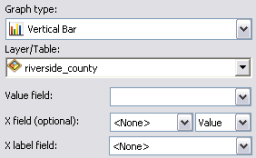
- Click the Graph type drop-down arrow and choose Bar type.
The procedure for vertical and horizontal bar graphs is similar. The main difference is that, for vertical bar graphs, the Value field values are distributed along the x- (horizontal) axis, and for horizontal, bars are distributed along the y- (vertical) axis.
- Click the Layer/Table drop-down arrow and choose the layer or table containing the data values to be graphed.
- Click the Value field drop-down arrow and choose the data field to graph.
The wizard shows the initial version of the graph.
The bars of the graph are initially in the order of the data values in the source table. Change the order of the bars based on another field using the X field parameter.

For example, you have a table with both economic (GDP) and demographic (population) fields. If you set Value field to GDP and leave X field as the default, <None>, the bars are sorted based on the order of the data values of the GDP in the table. But if you then set X field to a population field and the type to Ascending, the bars are sorted with the least populous country on the left side of the graph and subsequent bars to the right for countries with increasing population.
- Specify a different field with which to label the bars in the graph in X label field, commonly a text (string) field.
- Set properties of the label axes from the Vertical axis and Horizontal axis drop-down menus.
- By default, the values of the input data are added to the legend of the graph. Uncheck the Add to legend check box to disable this.
- Check the Show labels (marks) check box to see the bars in the graph labeled with their actual values.
This is useful when there are bars of similar values, where the small difference in bar height may not be easily seen.
- Use the Color and Bar style controls to change the appearance of the bars in the graph.
There are 13 bar styles available for you to choose; however, you might want to exercise some caution when choosing a style other than the default rectangle style. If not carefully authored, styles such as the pyramid, inverted arrow, or bevel can be difficult to interpret. Further, ensure you avoid "chart junk", a term often associated with distracting or difficult-to-interpret decorations used on graphs.
Tufte, E. R., The Visual Display of Quantitative Information, Graphics Press: Cheshire, Connecticut, 1983.
- If you have more than one series, click the Multiple bar type control to change how the bars for those series display together.
The bars for different series can be displayed in several ways: side by side or stacked on top of each other.
- Use the Bar size (%) control to make the bars wider or thinner to your preference.
- Click Show border to draw a perimeter box around each bar in the graph.
- Click Next to proceed to the general properties page to complete your graph.