Available with Business Analyst license.
The Advanced Thematic Mapping tool allows you to symbolize points, lines, or polygons. The following are selectable options:
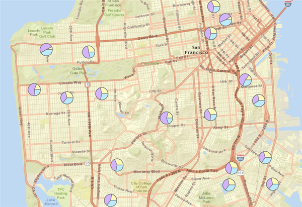
Displaying Points as Charts
You can display the points on your map as charts using the Advanced Thematic Mapping wizard. Charts can be effective for comparing several values at once. For example, you might display your stores as a pie chart, each wedge representing the percentage of total yearly sales for a specific product. A pie chart is useful for comparing proportions of different categories in a total amount, whereas a bar chart compares actual values rather than proportions of a total.
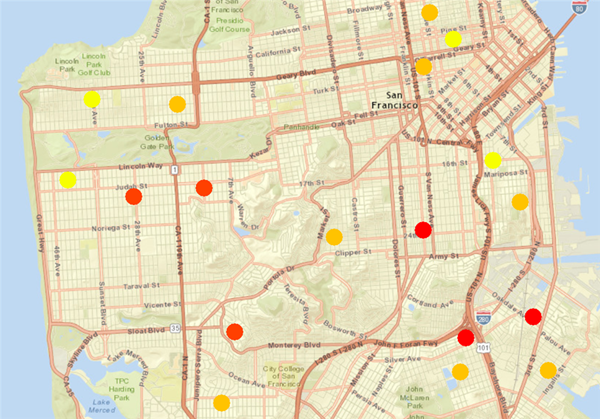
Displaying Points as Different Colors
Displaying points as different colors based on the values of a numeric attribute is an example of a graduated color map. Because colors don’t necessarily imply a magnitude, this kind of map is useful for showing data that is ranked, such as 1 to 10 or low to high, or has numerical progression such as measurements, counts, rates, or percentages. For example, you might want to display your customers as different colors depending on how many times a year they visit the store.
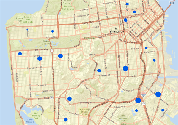
Displaying Points as Different Sizes
You can display points using a symbol that varies in size to represent different values. This is an example of a graduated symbol map. Graduated symbols work best for counts and amounts, since most people associate the size of the symbol with magnitude. For example, stores could be displayed as different sizes according to their sales volume, or you could show customers according to total purchases or visits.
Displaying Lines as Different Colors
Using different colors can be an effective method for displaying lines; the color of the lines varies according to the value of a particular attribute. Because colors don't necessarily imply a magnitude, this is useful for showing data that is ranked, such as 1 to 10 or low to high, or has some kind of numerical progression such as measurements, rates, or percentages. For example, you could display travel routes as different colors according to the store each customer visits.
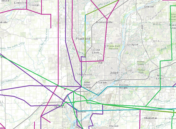
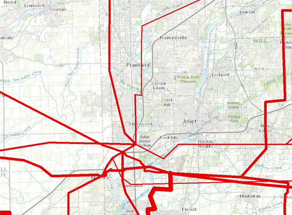
Displaying Lines as Different Thicknesses
You can display lines as different thicknesses to represent different values. This is another example of a graduated symbol map. Graduated symbols work best for counts and amounts, since most people associate the size of the symbol with magnitude. For example, roads could be displayed as different thicknesses based on traffic volume during rush hour. Travel route volume could be displayed by total sales or number of visits for each customer.
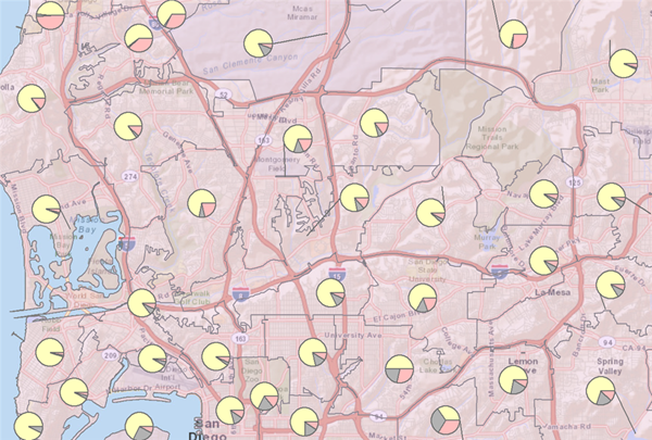
Displaying Charts in Areas
You can display charts in areas on your map using the Thematic Mapping wizard. Charts can be effective for comparing several values at once. For instance, you might display ZIP Codes as a pie chart, each wedge representing population by race. You could display tracts as bar charts representing the number of people who rent and those who are homeowners. A pie chart is useful for comparing proportions of different categories in a total amount, whereas a bar chart compares actual values rather than proportions of a total.
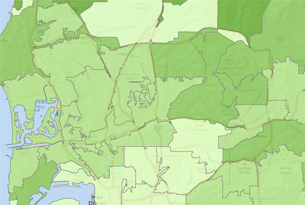
Displaying Areas as Different Colors
Displaying areas as different colors based on the values of a numeric attribute is another example of a graduated color map. Because colors don't necessarily imply a magnitude, this kind of map is most useful for showing data that is ranked, such as 1 to 10 or low to high, or has numerical progression such as measurements, rates, or percentages. For example, you could display block groups according to average income or ZIP Codes by number.
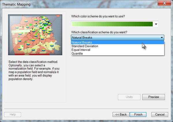
Classification Methods
There are several different classification methods you can choose to organize your data when doing thematic mapping.
- With the Natural Breaks classification method, data values that cluster are placed into a single class. Class breaks occur where there is a gap between clusters. Use this method if your data is unevenly distributed; that is, many features have the same or similar values and there are gaps between groups of values.
- With the Standard Deviation classification method, class breaks are placed above and below the mean value at intervals of 1, 0.5, or 0.25 standard deviations until all the data values are included in a class.
- In the Equal Interval classification method, each class has an equal range of values; that is, the difference between the high and low value is equal for each class. Use this method if your data is evenly distributed and you want to emphasize the difference in values between the features.
- With the Quantile classification method, each class has roughly the same number of features. If your data is evenly distributed and you want to emphasize the difference in relative position between features, use the Quantile classification method. For example, if the point values are divided into five classes, points in the highest class would fall into the top fifth of all points.
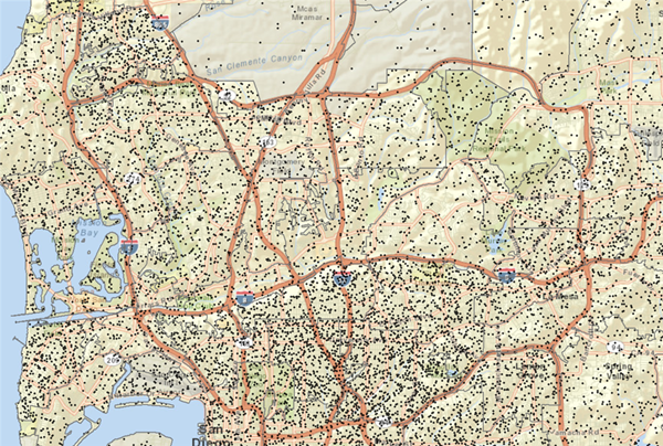
Setting Dot Density in Areas
Dot density allows you to show where things are concentrated (such as people per square mile). This is good for showing how an attribute is distributed throughout an area. For instance, a dot density map depicting population will show the strongest concentrations of dots where most people live such as along rivers and near coastlines.
