When you are working with temporal data, it can be important to understand the temporal distribution of the data. In other words, it can be useful to understand how much data exists at different periods of time. The histogram in Playback Manager provides one way to view the temporal distribution of your data, but it is limited by the fact that it is one-dimensional. A more powerful tool for analyzing the temporal distribution of your data in Tracking Analyst is the data clock. Because the data clock is a two-dimensional chart, it allows you to analyze patterns in the temporal distribution of your data at two different frequencies.
To understand this concept, imagine you have a tracking layer showing the occurrences of violent crime in a neighborhood over the last three months. The histogram in Playback Manager may indicate that the occurences of crime have remained consistent over the 12-month period. However, there could be a pattern hidden in the data that you are not seeing. After creating a data clock to chart the data by month and also time of day, you notice a pattern. Although the total crime by month has remained relatively constant, there has been a dramatic increase in the occurrences of crime between 9:00 p.m. and 11:00 p.m. This pattern would be difficult to observe using other methods of data analysis.
The Data Clock Chart
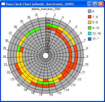
The Data Clock Chart is a circular chart. It is divided into cells by a combination of concentric circles and radial lines, similar to the spokes on a bicycle wheel. The concentric circles divide the data in one way, such as by month of the year, and the radial lines divide the data in a different way, such as by day of the month. This is the case in the example shown here.

The color of each cell in the data clock indicates how many events exist in that cell. For example, a red cell in the above data clock indicates that between one and four events exist for the selected month of the year and day of the month.
Data summary methods
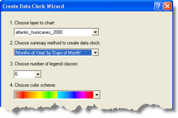
The Create Data Clock Wizard is used to create data clocks. The example below shows the settings that generate the data clock chart shown above. One of the settings is the data summary method for your data clock, and 'Months of Year' by 'Days of Month' is selected in this example. The first part of the method ('Months of Year' in this example) represents how the concentric rings are divided, and the second part ('Days of Month' in this example) represents how the radial lines are divided. In other words, each ring represents a month of the year, and each wedge represents a day of the month. Each individual cell is a combination of a ring and a wedge and therefore represents a particular month of the year and a particular day of the month.

The Choose summary method to create data clock drop-down list provides a complete listing of the summary methods that are available. It is up to you to determine which summary methods will reveal the most information about your data. If you are familiar with your data, you can select a summary method that will emphasize certain patterns in your data. For example, if you know your data contains more events in the summer months than in the winter months, you might want to choose 'Months of Year' as part of your summary method to emphasize this pattern. Alternatively, if you are exploring your data for the first time, you might want to try a couple different methods in an attempt to discover patterns in your data.
Data clock properties
The Create Data Clock Wizard dialog box also allows you to define the legend for your data clock. You can specify the number of classes to be used and choose the color ramp that is used to determine a color for each class. After a data clock is created, you can modify these properties by accessing the Data Clock Properties dialog box. This can be done by right-clicking anywhere on the Data Clock Chart dialog box and clicking Properties in the context menu. Several other properties of the data clock can be modified from this dialog box, such as fonts, labeling, and legend placement.
Selecting events from a data clock
Tracking events can be selected directly from data clock cells in the Data Clock Chart dialog box. Either click once or click and drag a box to highlight cells in the data clock. Selected data clock cells that contain events will be highlighted in the Data Clock Chart dialog box, and the corresponding events will also be selected on the map. Selection of events directly from the Data Clock Chart dialog box will respect the interactive selection settings in ArcMap. For example, you can add to the current selection or remove from the current selection.
Data Clock Manager
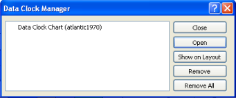
Tracking Analyst provides Data Clock Manager to help you keep track of multiple data clock charts you have created. You can rename, remove, and modify a data clock after you have created it using Data Clock Manager. You can also use the Show On Layout button to place a data clock on the ArcMap layout view. This can be useful if you want to include a data clock on a printed map document or an exported map image.
