Available with Business Analyst license.
The Game Plan Map is created from the result of a Game Plan Chart in which a target profile is compared to a base profile.
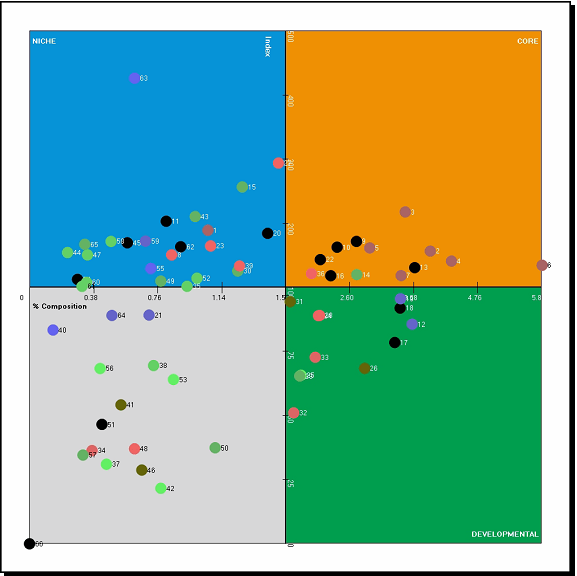
The Game Plan Chart, also referred to as a four-quadrant chart, is an adaptation of the standard scatterplot chart. The chart displays the results of a profile comparison report. The x-axis is based on the percent composition of the target profile, and the y-axis is based on the index values of each segment. The sample chart below graphs the Tapestry segments based on their index and percent composition values.

The Game Plan Chart above is divided into four quadrants: Core, Developmental, Niche, and Other. By default, the Index axis is set to a value of 100. The Percent Composition axis is set to the median percent composition value of all 66 segments in the profile. These values can be manually adjusted by clicking and dragging the axes on the chart. Each of the four quadrants is explained below.
- The Core (top right) quadrant includes all the segments that have an index and a percent composition greater than the value of each axis. You can conclude that you are dominating in these segments, because these segments are indexing well and make up a large portion of your customers. Target your marketing efforts to these customers.
- The Developmental (bottom right) quadrant includes the segments that have a high-percent composition but an index less than the Index axis value. You can conclude that segments in this quadrant require some investment. Although there are a substantial number of consumers in the segments contained in this quadrant, they are actually indexing lower than the base. You are not reaching these segments effectively compared to the base profile. You should consider creating a marketing message that will reach these segments more effectively.
- The Niche (top left) quadrant includes segments that have an index above 100 but a less-than-average percent composition. Although the segments in this quadrant are indexing well, there are not many of them. These can be targeted for specialized micromarketing activities.
- The bottom left quadrant includes segments that have a low index and a percent composition less than average. You can conclude that households in these segments probably do not like the product or service you are analyzing. You will likely receive a lower return on investment if you market to these segments.
The sample graph above illustrates how each of the four quadrants of the Game Plan Chart are assigned a color. All the segments that fall into the Core quadrant are within the orange section. All segments are assigned a color based on the quadrant in which they display in the chart.
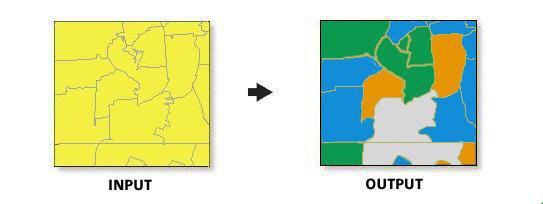
The four-quadrant map should only be created at the block group layer, since this level of geography has a single segmentation assignment. In the example below, a section of block groups in San Francisco, California, has been mapped in conjunction with the graph above.
