Box plots are useful for very large (sorted) datasets that are not suitable to other graph types such as line graphs. A box plot summarizes the variability of data values in a series into five numbers—the median, the upper and lower quartiles, and the minimum and maximum values. Box plots require the data to be sorted. Box plots provide a quick visual summary that easily shows center, spread, range, and any outliers. They are often used to compare the variability of several series from either the same dataset or several different datasets.
When you want to compare two or more sets of data, you make side-by-side box plots. This type of box plot is very efficient in comparing center and spread of two or more datasets, since you can immediately visualize the ranges, medians, and "shapes" of each dataset.
Selections are represented by the fill color. Since line symbols do not use a fill color, they will not show the selection. To see selections on the outlier symbols, change the style to one of the shape options (triangle, down triangle, diamond, left triangle, right triangle).
By default, the star line symbol is used for the extreme outlier, so if you want to see the selection represented, change the style.
The steps below describe how to create a box plot of one series, but normally you would use this graph type to compare several series.
- Click the Tools menu, point to Graphs, then click Create Graph
 .
.
- Click the Graph type drop-down arrow and choose the Box Plot type.
- Click the Layer/Table drop-down arrow and choose the layer or table containing the data values that are to be graphed.
- Click the Value field drop-down arrow and choose the field of values to graph. The wizard shows the initial version of the graph.
- By default, the box plot does not have a legend. You can add a legend to the graph by checking the Add to legend check box.
- To show the data values in the graph, check the Show labels (marks) check box.
- You can change the color of the markers on the graph with the Color control.
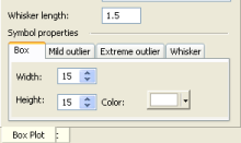
- Use the Whisker length control if you want to change the standard threshold beyond which data values are considered outliers.
The default value of the whisker length is 1.5, which means that values beyond 1.5 times the length of the box (interquartile range, or where the middle 50% of the data values lie) are determined to be outliers.
- You can change the appearance of the box plot with the Symbol properties tabs.

- Use the Box tab to change the size of the box shape of the graph (relative to the total graph area) and its fill color.
- With the Mild outlier and Extreme outlier tabs, you can control the size and shape of the outlier symbols. The fill color of polygonal shapes is determined by the Color control.
- The Whisker tab is used to alter the thickness, style, and color of the whiskers of the box plot.
- Click the Next button to proceed to the general properties page to complete your graph.