A pie graph consists of a circle (pie) divided into two or more sections (slices or wedges). Pie graphs emphasize where your data fits in relation to a larger whole and are particularly useful for showing proportions and ratios. Pie graphs work best when your data consists of several large categories (three to seven); too many categories will divide the pie into small segments that are difficult to interpret.
Controlling pie graphs
If you have a table of the human cases of avian flu virus by country in a table, in the order of when the virus was first discovered (from 1997 to December 2005), the pie graph will have the wedges in the same order (counterclockwise) as they are in the table:

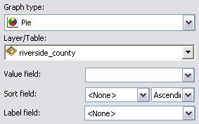
If you want to have the wedges in the graph sorted in order of size from largest to smallest, set the Sort field to Cases and the sort type to Descending. The default label field is <None>, but to see the name of the country instead, set the Label field to the Country text field (see the left figure below). Alternatively, to have the wedges in alphabetical order by the country name, set the Sort field to Country (right figure below).

Selections on pie graphs
Only a single wedge can be selected on pie graphs. It is not possible to dynamically select multiple adjacent wedges with a selection marquee or with a shift-click action. The selection point is based on the cursor location where the mouse button is released.
- Since pie graphs do not have axes, any settings in the Axis properties for them will not have any effect.
- Pie graphs are not typically well suited for displaying negative values. Bar charts would be more appropriate, as negative values can be represented as being below a baseline. If negative values are used in the input to a pie graph, their absolute values are used in the graph.
- Click the View menu, point to Graphs, then click Create Graph
 .
.
- Click the Graph type drop-down arrow and choose the Pie type
 .
.
- Click the Layer/Table drop-down arrow and choose the layer or table containing the data values that are to be graphed.
- Click the Value field drop-down arrow and choose the field of values to graph. The wizard shows the initial version of the graph.
The wedges of the graph are initially displayed with the first data value starting at the three o'clock position and subsequent values plotted as subsequent wedges in the counterclockwise direction.
- Sort the wedges in an ascending or descending order based on another field with the Sort field parameter.

- Specify a different field with which to label the wedges in the graph in Label field, commonly a text (string) field.
- By default, the values of the input data are added to the legend of the graph. Uncheck the Add to legend check box to disable this.
- Check the Show labels (marks) check box to see the wedges in the pie labeled with their actual values. This is useful when there are wedges of similar size, where small differences in their size may not be easily seen.
- Change the color of the wedges in the graph with the Color control.
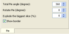
- To create partial instead of full circles for the pie graph, reduce the Total Pie angle setting from the default of 360°.

- Adjust in degrees the starting point of the pie graph from its default three o'clock position with the Rotate Pie control.
- Highlight the largest single wedge of the pie with the Explode the biggest slice (%) control.
- Uncheck the Show border check box to remove the outline of the pie and all of the wedges.
- Click Next to proceed to the general properties page to complete your graph.