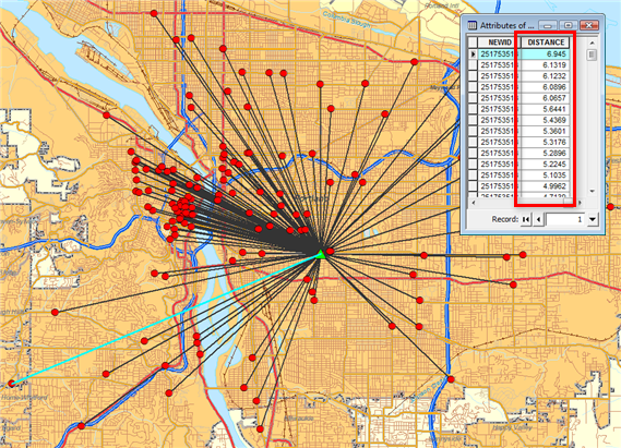
Desire lines show which customers visit which stores. A line is drawn from each customer point to its associated store point, making it easy to see the actual area of influence of each store.
Spider diagrams are a series of rays drawn from each customer to the store. They can be unweighted (where each customer is counted equally) or weighted (the line from each customer is drawn in different colors or thicknesses depending on variables such as sales or visits). Spider diagrams graphically illustrate the direction of pull in the marketplace. More customers may be pulled from one or two directions than from other directions. Spider diagrams also provide a quick and simple method to see if stores are cannibalizing each other.
The graphic below shows unweighted desire lines drawn from each customer to its store. The desire lines are drawn as different colors for each store.
Weighted values aren't used to calculate desire lines but to display the lines differently. The thickness (or color) of each desire line is proportional to the weighted variable for that particular customer.
Spider diagrams can be weighted by any number in the customer database. For example, a hospital might weight each patient line by the number of hospital stays per year. Insurance policyholders might be weighted by the number of policies or the dollar value of claims.
Some other examples of desire lines include the following:
- A lawn and garden operation uses desire lines to adjust advertising expenditures by visualizing the greater draw toward expanding suburbs and a more limited reach toward the inner city. New locations are located accordingly.
- A national home improvement/builder's supply operation maps weekday and weekend spider diagrams to better understand variations in these market segments.
- A convenience store/gas station chain creates desire lines based on affinity card data to examine the impact of new suburban locations on older, highway-oriented stores. Older, marginal operations are closed when excessive cannibalization can be seen.
- A multistore dry cleaning/laundry operation uses customer addresses and time of day to visualize customer travel patterns such as going to work versus going home.
- Large supermarket chains use desire lines weighted by sales to analyze the effect of distance on expenditures per visit.
- A retailer uses spider diagrams to identify weekday versus weekend shoppers. The resulting analysis can then be used to identify consumer behavior and shopping patterns. For example, weekday shoppers travel shorter distances than weekend shoppers.
Input Prerequisites
You must have customer and store layers with customer to store assignments already generated.
Output Example
This image below shows typical output from a desire lines analysis. The attribute table contains a distance field representing the travel time/length between a store and its customers. The map visually shows the spokes between the store and customer points. The desire lines show the association between points usually in a one-to-many fashion. The selected desire line spoke (in blue) is indicated in the table (highlighted in blue) with a figure of 6.945 that represents the straightline mileage distance between a store and where the customer lives.
