Raster datasets can be displayed, or rendered, in your map in many different ways. Rendering is the process of displaying your data. How a raster dataset is rendered depends on what type of data it contains and what you want to show. Some rasters have a predefined color scheme—a color map—that ArcMap automatically uses to display them. For those that don't, ArcMap chooses an appropriate display method that you can adjust as needed.
You can change these methods using the Image Analysis window or by opening the layer's Properties dialog box and editing the parameters on the Symbology tab. To preserve the rendering properties you've set, you can save a layer (*.lyr) file.
Methods of rendering raster data
Stretched
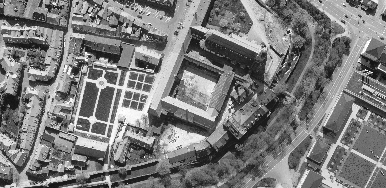
The Stretched renderer displays continuous raster cell values across a gradual ramp of colors. Use the Stretched renderer to draw a single band of continuous data. The Stretched renderer works well when you have a large range of values to display, such as in imagery, aerial photographs, or elevation models. Below is an example of the Stretched renderer on a single band in a multiband raster dataset:

You can choose from several different automatic stretches and a manual option when deciding exactly how to stretch the values.
RGB Composite
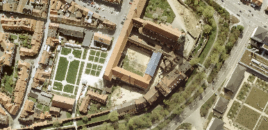
The RGB Composite renderer uses the same methods as the Stretched renderer but allows you to combine bands as red, green, blue composites. When viewing color aerial photography, you are often viewing a three-band raster dataset, and this renderer is applied by default. You will also want to use this renderer to display different combinations of bands when working with multiband raster datasets, such as satellite or aerial imagery.
Below is an example of a multiband raster dataset displayed using three bands. The image above uses the Stretched renderer to display one of the bands in the raster dataset. The image below was created with the RGB Composite renderer and displays with color:

Classified
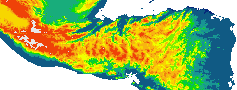
The Classified renderer is used with a single-band raster layer. The Classified method displays thematic rasters by grouping cell values into classes. Use this type of thematic classification on continuous phenomena, such as slope, distance, or suitability, where you want to classify the range into a small number of classes and assign colors to those classes. Below is an example of an elevation raster dataset displayed using the Classified renderer:

You can choose one of these classification methods:
- Manual—Lets you set the class breaks. Use this choice if, for example, you want to emphasize particular patterns by placing breaks at important threshold values or if you need to comply with a particular standard that demands certain class breaks.
- Equal interval—The range of cell values is divided into equally sized classes where you specify the number of classes. Use this method to emphasize the relative amount of attribute values compared to other values. It is best applied to familiar data ranges such as percentages and temperature.
- Defined interval—You specify an interval to divide the range of cell values, and ArcMap determines the number of classes.
- Quantile—Each class contains an equal number of cells. Use this method with linearly distributed data.
- Natural breaks (Jenks)—The class breaks are determined statistically by finding adjacent feature pairs between which there is a relatively large difference in data value.
- Standard deviation—Shows you the amount a cell's value varies from the mean. It is best applied on normally distributed data.
Geometrical interval—Creates class breaks based on class intervals that have a geometric series. The geometric coefficient in this classifier can change once (to its inverse) to optimize the class ranges. The algorithm creates geometric intervals by minimizing the sum of squares of the number of elements in each class. This ensures that each class range has approximately the same number of values with each class and that the change between intervals is fairly consistent.
This algorithm was specifically designed to accommodate continuous data. It is a compromise method between equal interval, natural breaks (Jenks), and quantile. It creates a balance between highlighting changes in the middle values and the extreme values, thereby producing a result that is visually appealing and cartographically comprehensive.
One example for using the geometrical interval classification would be with a rainfall dataset in which only 15 out of 100 weather stations (less than 50%) have recorded precipitation and the rest have no recorded precipitation, so their attribute values are zero.
Unique Values
The Unique Values renderer is used to display each value in the raster layer individually. For instance, you might have discrete categories representing particular objects on the earth's surface, such as those in a thematic raster layer, which could display soil types or land use. Below is an example of a classified raster dataset showing land use:

The Unique Values renderer displays each value as a random color. If your data has a color map, you can use the Colormap renderer to display your data with assigned colors.
Colormap
Use the Colormap renderer as you would the Unique Values renderer or when you want the values in the raster layer to be represented by a prespecified color.
The Colormap renderer appears automatically in the list of available renderers on the Symbology tab if a color map is present with the raster dataset.
Discrete Color
Use Discrete Color when you want to display the values in the raster dataset using a random color. This renderer is similar to the Unique Values renderer, but it is more efficient when there are a large number of unique values as it does not have to calculate how many unique values exist. The Discrete Color renderer assigns a color to each unique value until it reaches the maximum number of colors that you chose. The next unique value starts at the beginning of the color scheme; this process continues until each unique value has a color assigned to it.
A legend displaying which color is mapped to which value is not generated or displayed in the table of contents.