- Workflow using ArcGIS Desktop, ArcMap
- Workflow using ArcGIS Pro
- Workflow using ArcGIS Online
- Workflow automation
- References and resources for learning more
The assignment
With the Edmonton Heritage Festival fast approaching, journalist Rachel Ward has been tasked with writing a story about the event. Featuring traditional music, dance, food, clothing, and artwork from around the world, the festival celebrates the many cultures found in Alberta, Canada. Because language underlies our cultural expressions - it shapes our thoughts and ideas, and infuses our experiences and values - Rachel decides her story will focus on linguistic diversity. Rachel's story for the Edmonton Journal, and the maps included in her article, are a tribute to the many languages and rich cultures found in Edmonton.
For this case study, you will take on the role of GIS analyst working for the newspaper. You have been given the task of measuring and mapping linguistic diversity in Edmonton. Your workflow is summarized below.
What data is needed?
You begin by getting data about the first language a person speaks. This is called the mother tongue, and refers to the primary language a person learns from birth. These data are available from Business Analyst or ArcGIS Online. Included are more than thirty different mother tongue languages: English, French, Italian, German, Punjabi, Cantonese, Spanish, Arabic, Tagalog, Portuguese, Polish, Mandarin, Chinese, Urdu, Vietnamese, Ukrainian, Persian, Russian, Dutch, Korean, Greek, Tamil, Gujarati, Romanian, Hindi, Hungarian, Croatian, Creoles, Serbian, Bengali, Japanese, Turkish, Czech, Somali, Aboriginal languages, and all other languages. For each neighborhood, you obtain a count for every one of these mother tongue languages, reflecting the number of people associated with each.
So far so good, but you notice that a number of the neighborhoods (60, in fact) do not have any data at all. Further inspection (using the Imagery base map), reveals that these neighborhoods comprise rural areas, industrial complexes, and causeways. Inquiries at local data procurement agencies disclose that the data for these neighborhoods has been suppressed to preserve anonymity. Unfortunately, the suppressed data will leave big holes in what you hope will be a series of beautiful maps.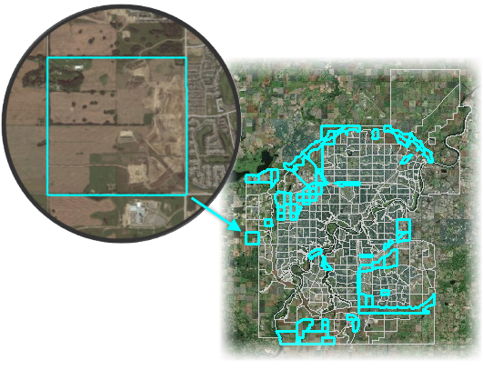
To eliminate the holes, you decide to combine (to aggregate) the neighborhoods where data has been suppressed, joining them with nearby neighborhoods where data is available. You could simply merge each of the no-data polygons with its nearest data neighbor. This, however, would put all of the impact of the aggregation onto a single neighbor. You decide, instead, to carve up each of the neighborhoods without data, and to distribute the resultant parts among all of the nearest data neighbors.
The result is 328 neighborhoods, all with data for mother tongue languages.
English and French are the official languages across Canada. Nonetheless, in several neighborhoods in Edmonton, more than 70 percent of the population have non-official mother tongue languages.
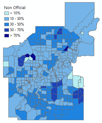
Most neighborhoods have high percentages of English mother tongue speakers; the mean for English mother tongue across all neighborhoods is 68 percent. In contrast, there are only two neighborhoods where the French mother tongue language exceeds 10 percent. Tagalog (from the Philippines) and Punjabi (spoken in the Punjab region of Pakistan and India) are prevalent non-official mother tongue languages in Edmonton. After English, the most common mother tongue language in Edmonton (based on mother tongue language counts), is Tagalog. After English, the highest concentrations of a mother tongue language (based on neighborhood percentages), is Punjabi.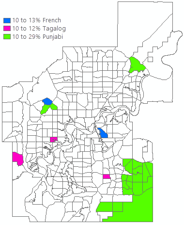
How is linguistic diversity measured?
You will use the Linguistic Diversity Index (LDI) developed by J. Greenberg to quantify the many languages spoken in Edmonton. This index expresses the probability that two people, selected at random, will both speak the same language. An index value of zero would result if everyone speaks the same language (zero diversity). An index value of one would result if everyone in the neighborhood speaks a different language (complete diversity). You are only considering mother tongue languages here, however. So while two people might speak the same language, this index only assesses the probability that they share the same mother tongue language. You will compute an LDI value for all 328 neighborhoods in Edmonton.
The math is straightforward. For every neighborhood individually, you calculate the proportion of people that speak each language, square all of these ratios, add them up, and then subtract the sum from one:
LDIi= 1 - ((EnglishMTi / NeighborhoodPopi)2 + (FrenchMTi / NeighborhoodPopi)2 + (ItalianMTi / NeighborhoodPopi)2 + … (OtherMTi / NeighborhoodPopi)2)
EnglishMTi is the number of people in a neighborhood (i) whose mother tongue is English. FrenchMTi is the number of people in a neighborhood (i) whose mother tongue is French, and so on. The subscript (i) indicates a particular neighborhood.
Which neighborhoods have the highest linguistic diversity?
With the LDI scores computed for each neighborhood, you can create a map of linguistic diversity. But compare the two maps below and notice how they tell different stories. The data for these two maps is exactly the same; the only difference is in how the data is being symbolized. 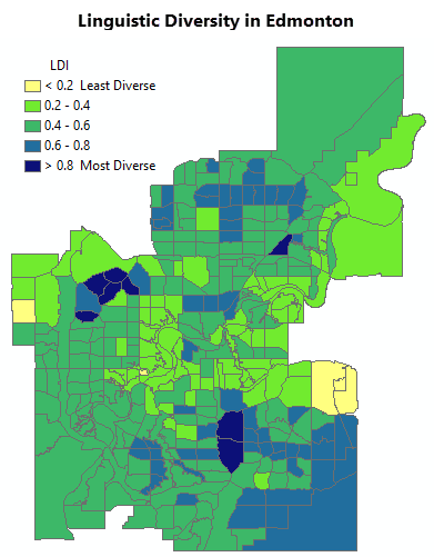
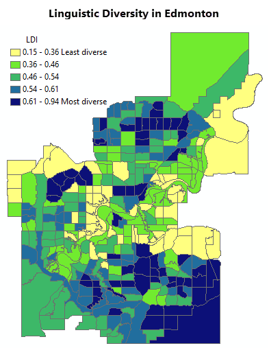
In the first map, you tried the equal interval rendering scheme (notice that the class breaks are even: 0.2 to 0.4, 0.4 to 0.6, and so on). Equal interval rendering is best applied with common data ranges such as percentages and temperatures. You would use an equal interval rendering scheme if you wanted to highlight specific value ranges; this is especially helpful when comparing maps with the same classification scheme.
In the second map, you tried a quantile rendering scheme (the LDI values are ordered and then distributed so that each class break has the same number of neighborhoods). Quantile rendering is best applied when you want to emphasize relative rankings (high, medium, low).
Each map tells a slightly different story about linguistic diversity. This underscores an important point: while maps do provide a powerful way to communicate your data and your analytical results, it is important to keep in mind that they can be visually subjective. As cartographers, we are the ones making the decision about what appears darkest blue versus what shows up a less intense green.
To help minimize some of this subjectivity, you decide to use hot spot analysis. With hot spot analysis, the color scheme of the resultant map is based on statistical significance. Hot Spot Analysis also provides an intuitive interpretation. The red areas are hot spots of linguistic diversity, exhibiting intense clustering of the largest diversity index scores. The darkest red color is associated with the hottest hot spots (most diversity) and a 99, out of 100, percent confidence level. The blue spots are cold spots of linguistic diversity; these are the areas where the lowest diversity indices cluster spatially. The darkest blue color is associated with the coldest cold spots (least diversity).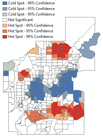
Beyond journalism, analytical maps like this one, can help Edmonton and other cities meet their mandates for diversity and inclusion.
Let's go!
With your maps and analysis complete, you're headed to the Edmonton Heritage Festival! I hope you're hungry, because the food looks fabulous! 